 Luxe Themes
14-day money-back guarantee
See how Nio compares in the best Ghost themes guide, or compare all Ghost themes by feature.
Nio
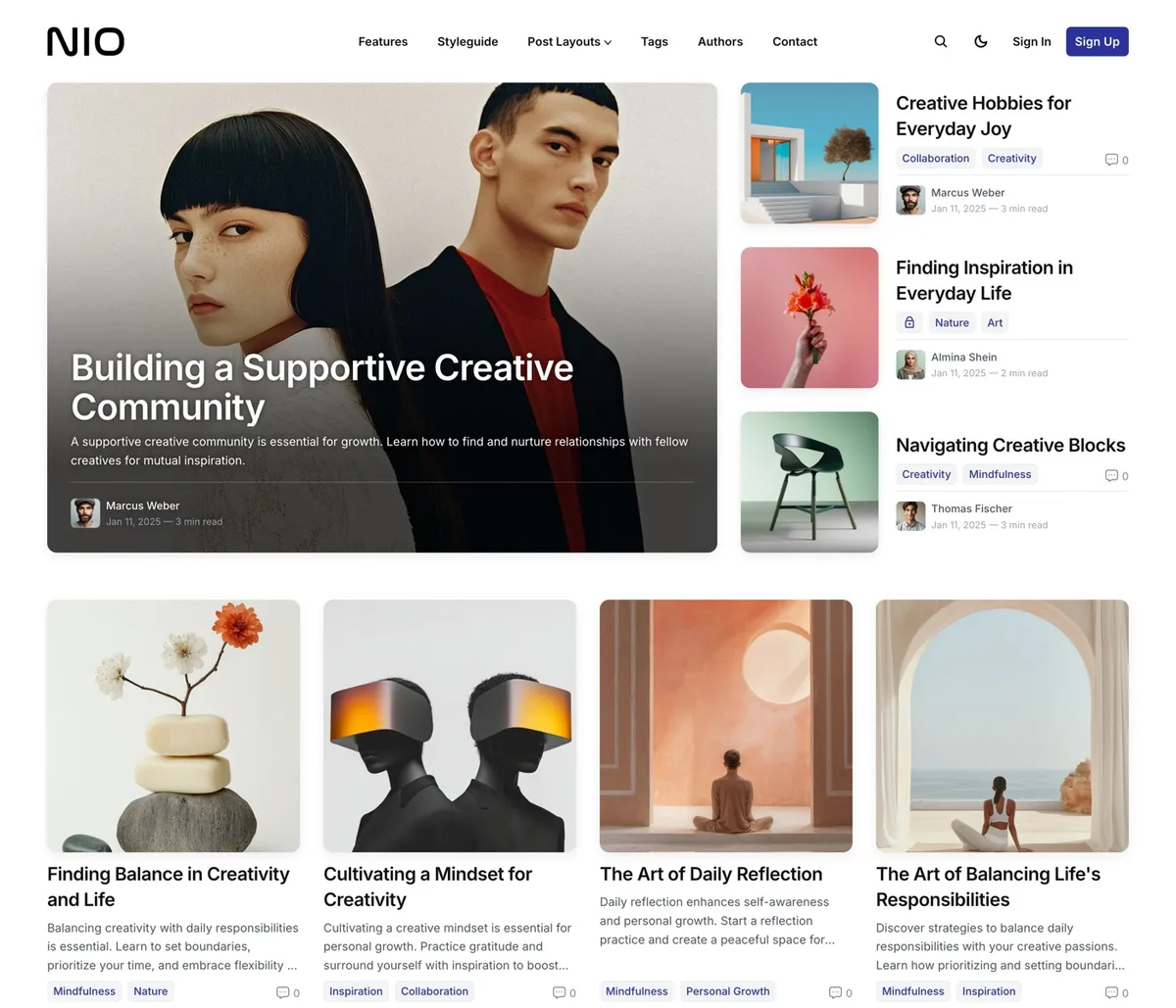
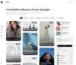
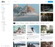
Nio is a grid of squares. One featured story as a large photo card, then your posts as square cards four across, a band for the topic you highlight, and a row of your authors. Every image sits in the same frame, so a page of mixed pictures stays in order. Built for studios, portfolios and design blogs, and managed entirely from Ghost admin.
Features
- Featured block of up to four stories
- Square post cards, four across
- Optional hero beside your cover image
- Full-width band for one highlighted topic
- Authors carousel and subscribe form on the front page
- Four post layouts, including full-width and split
- Dropdown menus that nest, overflow into More
- System, light or dark, with a switch for readers
- 21 heading and 14 body fonts
- Authors, tags and contact pages
- Subscribe form after every post
- 48 languages with right-to-left layouts
Squares, Lined Up
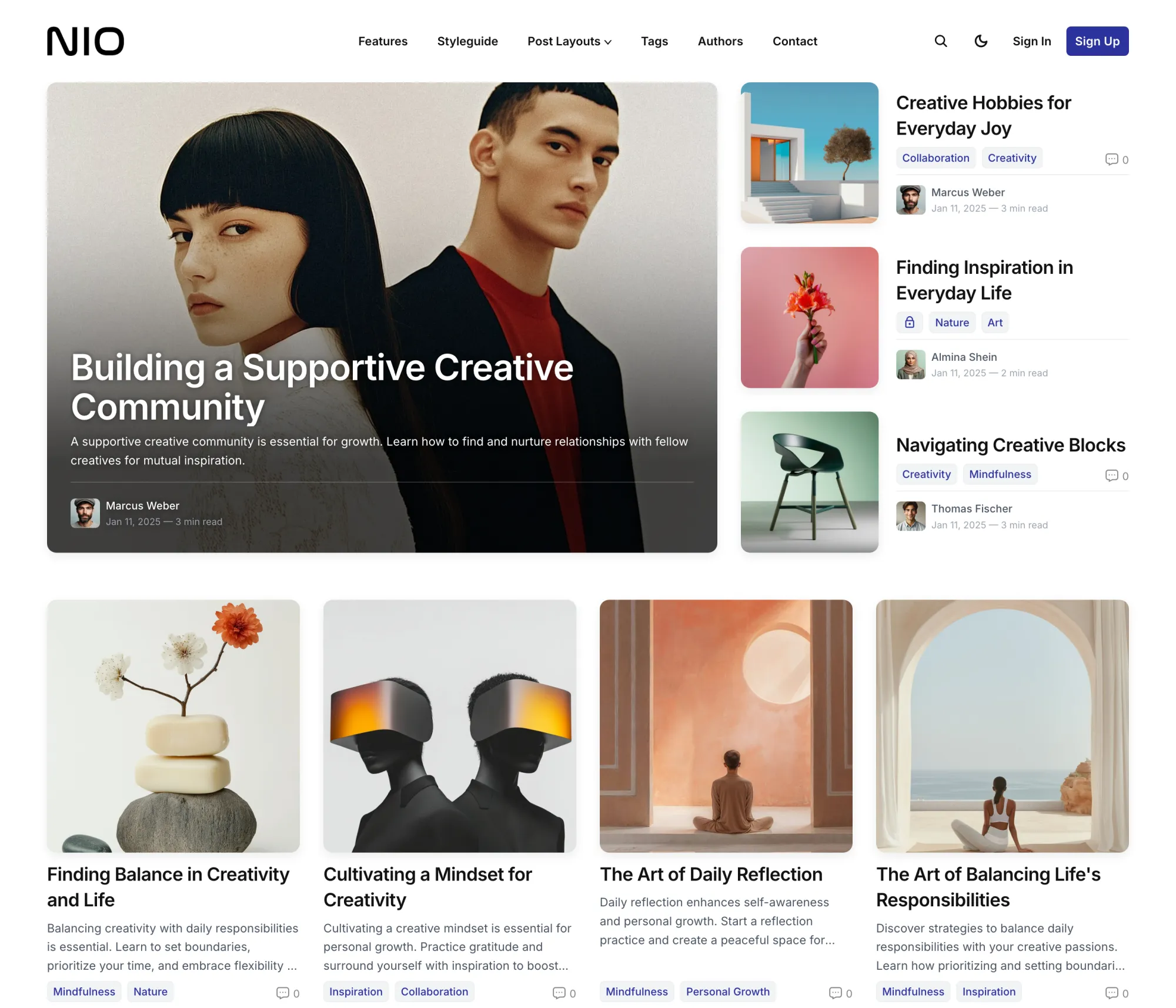
One featured story as a large photo card with the title set over it, three more stacked beside it, then your posts as square cards, four across. Portraits, landscapes and screenshots all sit in the same frame, and the page stays in order however mixed the pictures are.
We fixed the card shape on purpose. Uniform cards let unlike images share a page without arguing.
A Front Page in Sections
An optional hero with your cover image beside the text. The featured block and the grid. A full-width band in your accent color or a topic's own image for the one tag you highlight. Then a Read More grid, a carousel of your authors, and the subscribe form. Each section switches off in the settings or by leaving its field empty.
Four Ways to Open a Story
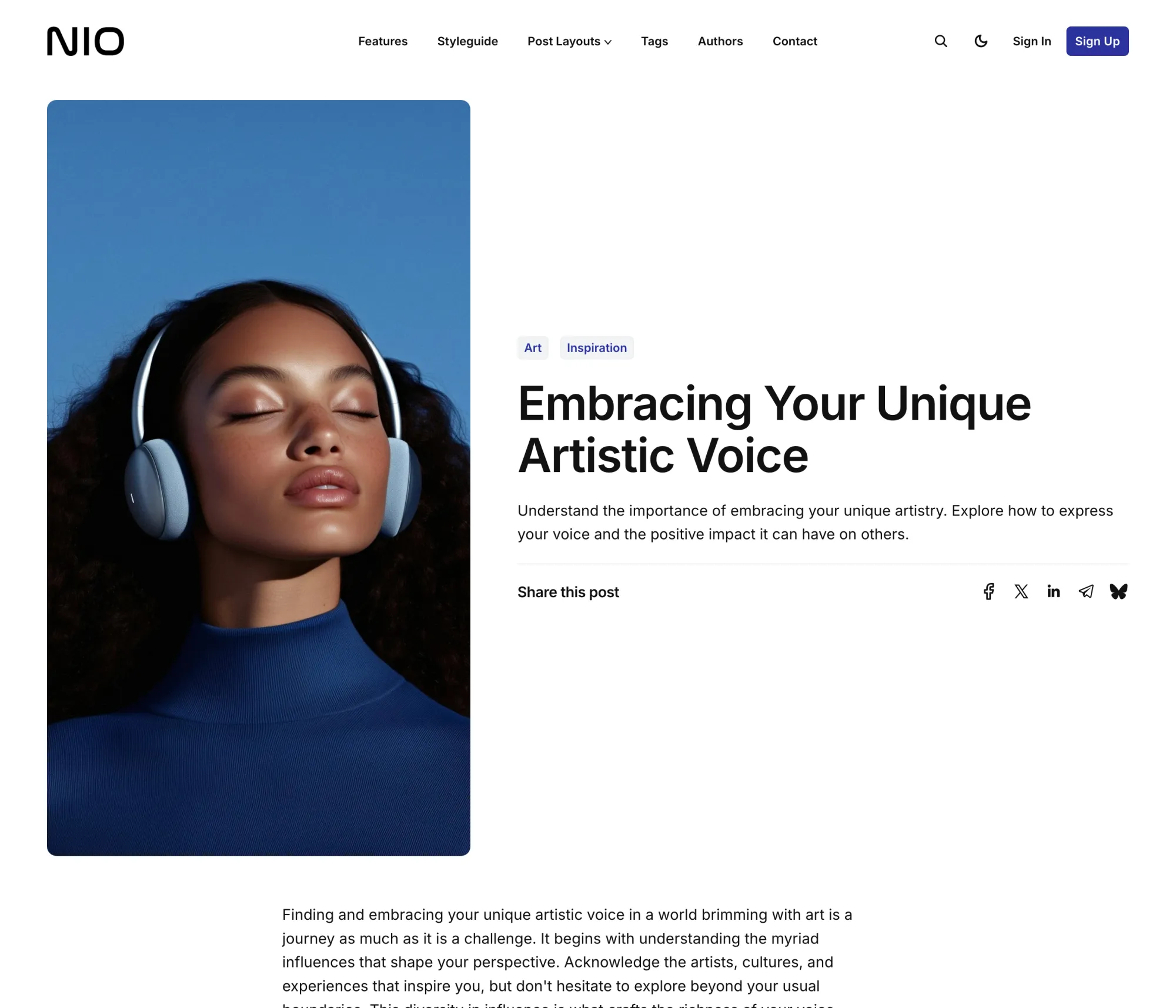
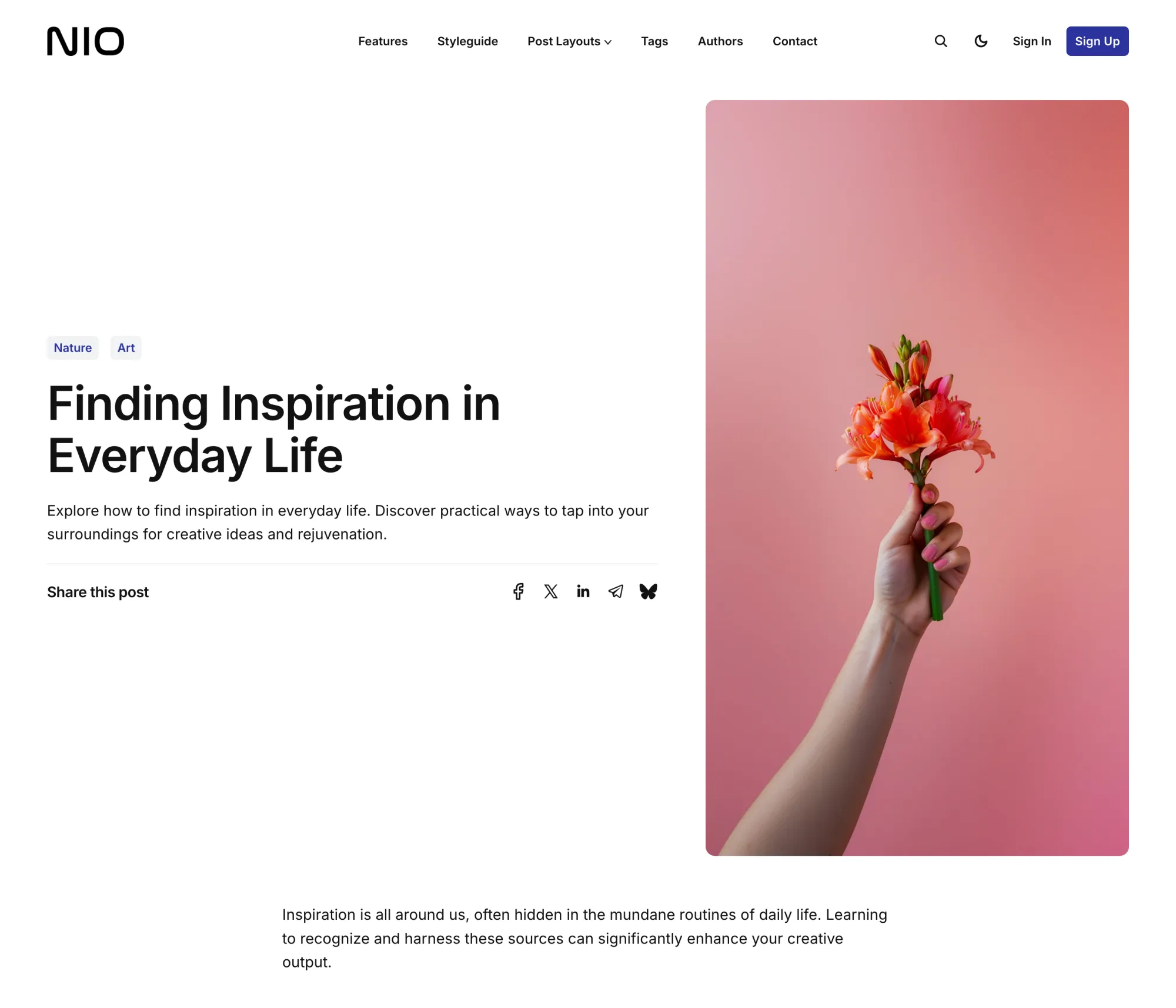
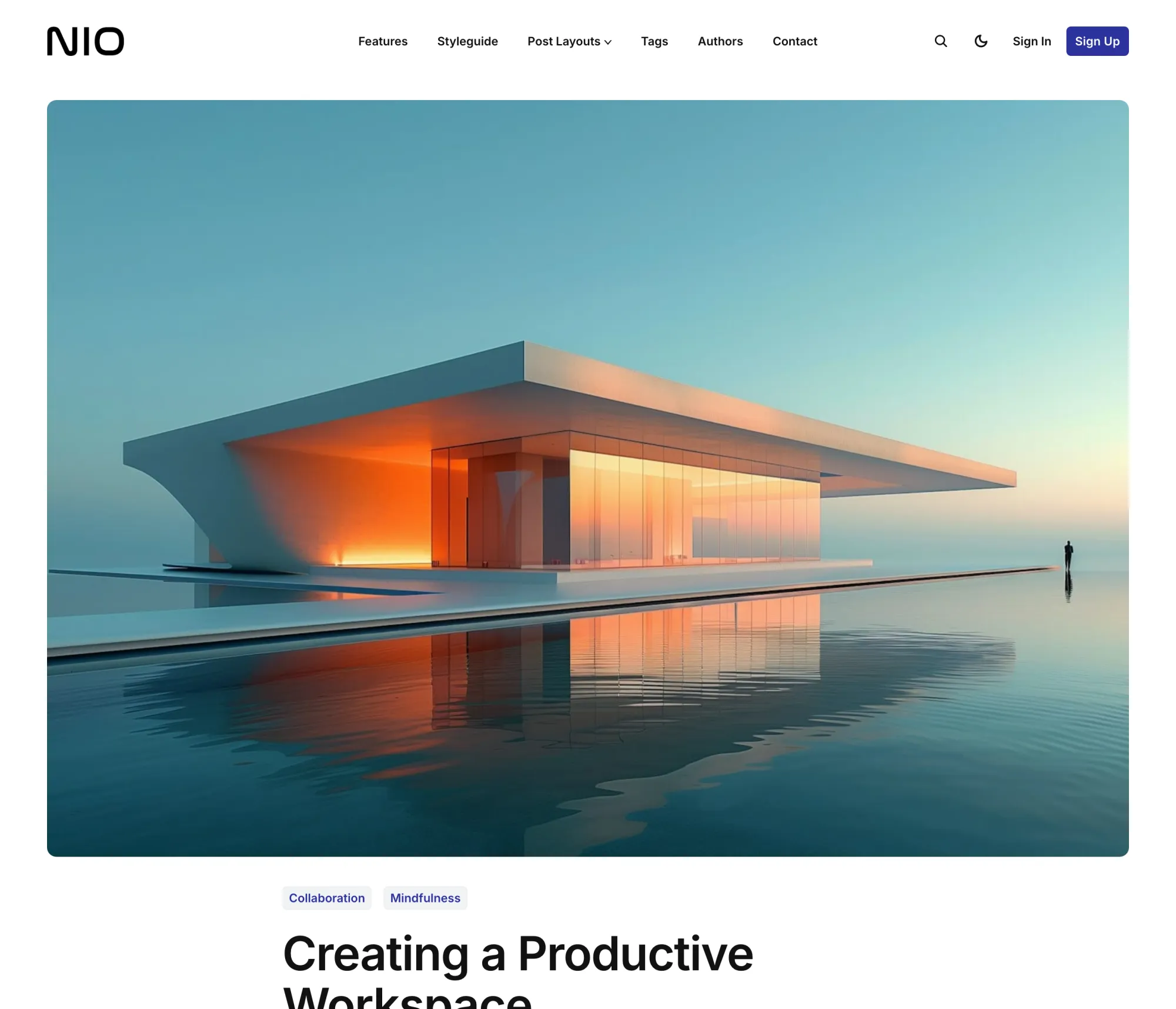
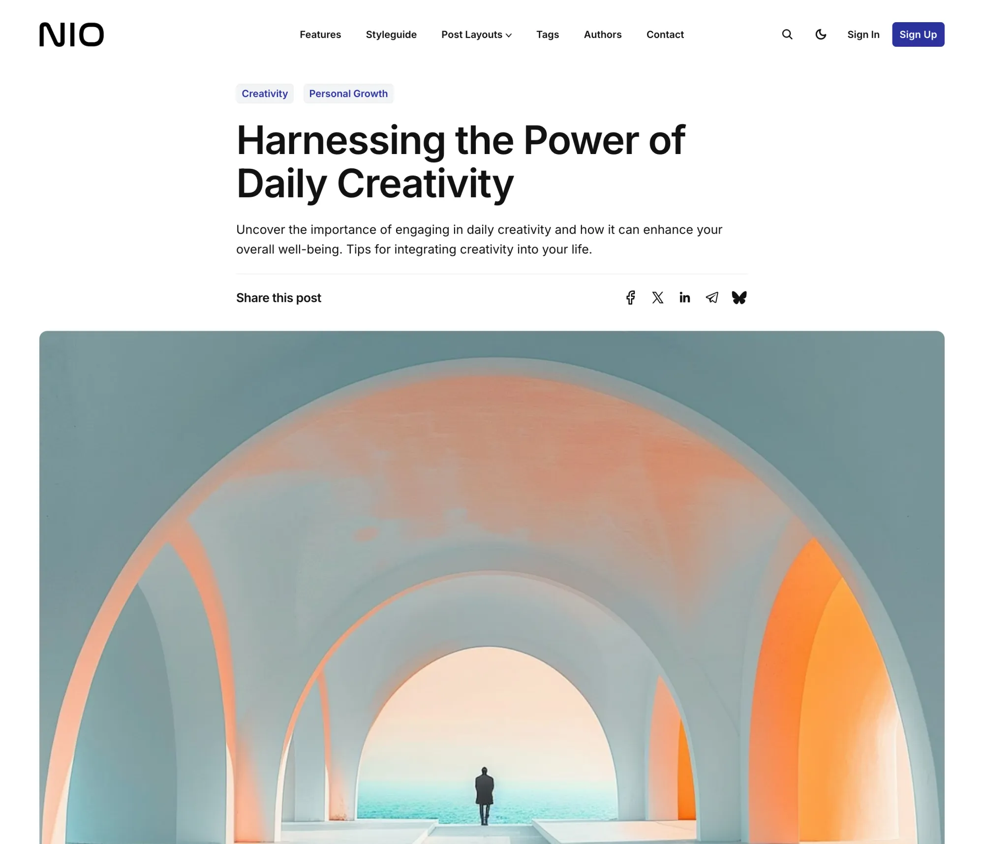
The picture beside the title, on the left or the right. A photograph across the whole screen with the title beneath. Or the title first with the image after it. You choose per story, in the editor.
Authors, Tags, and a Way to Reach You
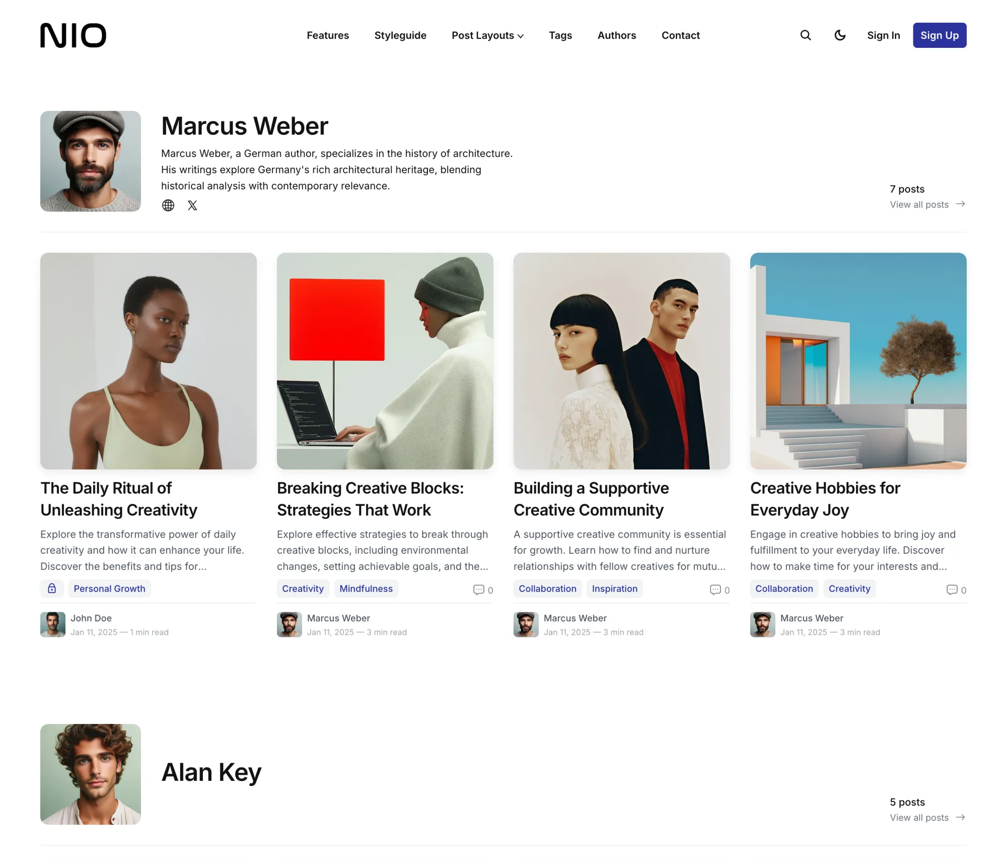
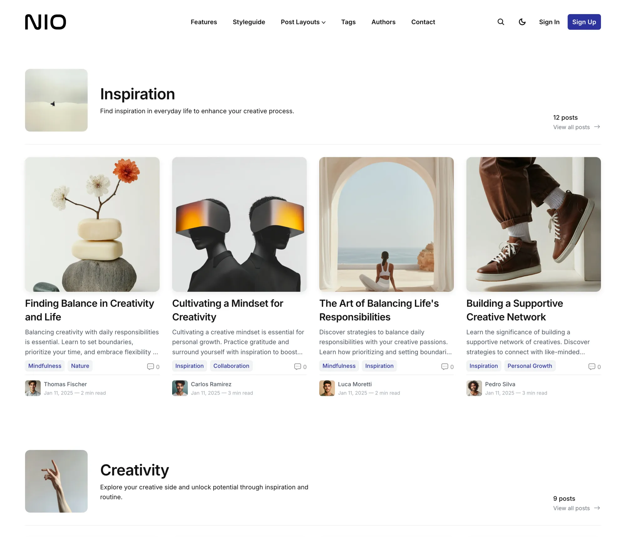
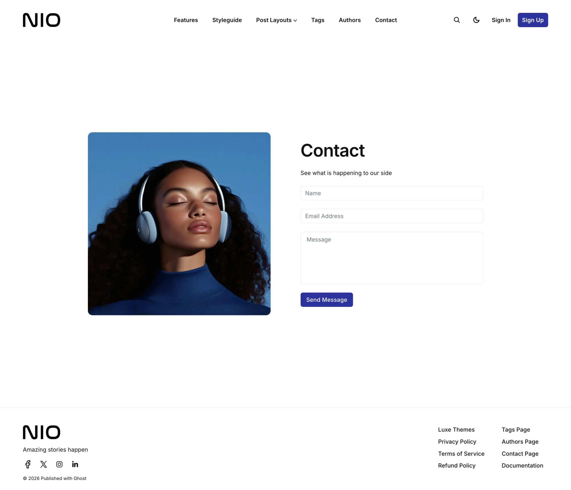
An authors page that gives each writer a portrait, links and their four latest stories. A tags page that does the same for every topic, with the tag's image. A contact page with your photo beside the form, posting to the service you already use.
A Menu That Never Wraps
Dropdowns that open on hover and can nest one inside another. Items that do not fit on one line fold into a More menu by themselves, so the bar stays a single row however many sections you add. On phones the whole menu opens as a full-width panel under the header.
Dark Mode by Default
Nio follows the reader's device out of the box, with a sun and moon switch in the header for anyone who wants the other one. Pin it to light or dark if you prefer. A second logo for the dark background, 21 heading and 14 body fonts, and your accent color on tags, buttons and the highlighted band.
Made For
Design studios, agencies, portfolios and small magazines that want order on the page. If you would rather your topics built the front page for you, Homa does that.
The Details
| Post layouts | Left Image, Right Image, Full Width Image, Text First |
|---|---|
| Page templates | Authors, Tags, Contact |
| Homepage | Optional hero beside the cover image, featured block of up to four, square grid, highlighted-topic band, Read More grid, authors carousel, subscribe form |
| Color | System by default, light or dark, optional visitor switch, dark logo slot, accent from Ghost |
| Fonts | 21 heading and 14 body fonts, or Ghost's own font settings |
| Reading | Related posts, five-platform share row, image lightbox, code highlighting, native comments, progress ring, subscribe form after every post |
| Members | Sign in, sign up and account through Ghost Portal |
| Languages | 48, English plus 47 translations, right-to-left layouts |
| Phones | Full-width menu panel, optional app mode for the home screen |
| Ghost | 5 and 6 |
$249 lifetime, was $821
Nio questions
Can I add a hero above the featured stories?
What decides the featured block at the top?
Does Nio have a pricing or membership page?
How do I add dropdown menus?
# as its URL and start the labels beneath it with a dash. Those become a dropdown that opens on hover, and a dropdown can hold another. Items that would not fit on one line fold into a More menu on their own. See the navigation docs.