 Luxe Themes
Senna
Documentation for the Senna theme for Ghost.
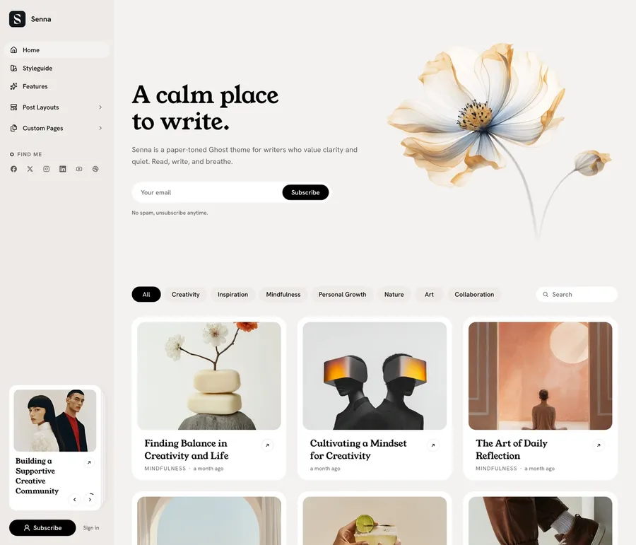
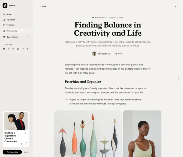
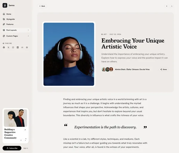
Welcome to Senna! Senna is a calm, paper-toned Ghost theme for writers. It pairs serif display headings with soft, rounded surfaces and a single accent color that you control. On desktop your site reads like a quiet magazine; on phones it behaves like an app, with a fixed tab bar instead of a hamburger menu.
This guide helps you install, customize, and get the most out of the theme. Everything in it happens in Ghost Admin — no code required. The last sections are for developers. If you’re new to Ghost, the official Ghost documentation is a good companion.
Requirements: Ghost 5.0 or later (validated against Ghost 6.x).
Installation and Updates
Installing the Theme
Follow these steps to add Senna to your Ghost site:
- Log in to your Ghost Admin.
- Go to
Settings>Design & branding>Customize. - Click
Change theme(bottom right). - Select
Upload themeand choose theSenna.zipfile you downloaded. - Once uploaded, click
Activate. - Restart Ghost once after the first install. Ghost only discovers a
theme’s custom page and post templates at startup, and Senna ships
several. On Ghost(Pro) this happens automatically; on a self-hosted site
run
ghost restart.
Removing the Theme
If you need to remove Senna:
- Go to
Settings>Design & branding>Customize. - Click
Change theme. - Find Senna in the list. Before deleting, activate a different theme (you can’t delete an active theme).
- Click the
...menu next to Senna and selectDelete. Confirm the deletion.
Updating the Theme
Keep Senna up to date with the latest features and fixes:
- Download the latest version of the Senna theme zip file.
- Go to
Settings>Design & branding>Customize. - Click
Change theme. - Select
Upload themeand choose the newSenna.zipfile. - Activate the updated theme.
Keep your settings when updating. Ghost ties a theme’s settings to the name of the zip file you first uploaded, shown in parentheses under Settings > Theme > Change theme > Installed. Rename the new download to that exact name before uploading, and confirm the overwrite prompt. A different file name, such as one with a version number, installs a second copy of the theme with default settings.
Important: Updating overwrites any direct code changes you’ve made to theme files. If you’ve customized the code, back up your changes before updating.
Recommended Setup Path
Follow these steps to go from a fresh install to a fully composed site. Each one is optional — Senna renders sensibly with plain content — but together they unlock the whole theme.
- Set your accent color — see Accent Color. Senna’s links, buttons, and highlights all follow it.
- Create the home hero. Make a page, tag it
#hero, and publish it — see Hero Section. - Pick a color scheme and fonts — see Color Scheme and Fonts.
- Build your navigation — see Navigation for icons and grouped menus.
- If you use memberships, create a
#subscribepage and the membership page — see Subscribe Section and Membership Page. - Add the index pages you want: tags, authors, contact, shop. Each is a page with a template assigned — see Page Templates.
How Senna Reads Your Content
Senna composes several sections from regular Ghost pages and posts, selected
by internal tags. Internal tags start with #, and visitors never see them —
they exist only to mark content for the theme.
| Tag | Add it to | What it does |
|---|---|---|
#hero | a page | Becomes the home hero. Title → heading, body → intro text, feature image → the framed photo beside them. Without an image the hero centers. |
#subscribe | a page | Drives the subscribe sections on the tags index and at the end of every post. Title → heading, body → the line under it, feature image → a photo background with a soft dark overlay. Without this page, a default “Be the first to know” section renders. |
#toc | a post | Adds a table of contents rail to the right edge of the screen — see Table of Contents. |
Every convention degrades silently. If the tagged page doesn’t exist, the section either falls back to sensible copy or disappears — nothing breaks.
Language Support
Senna ships with translations for 47 languages plus English — interface
text, button labels, and form messages all follow your publication
language. Regional variants are included: Swiss German (de-CH),
Brazilian Portuguese (pt-BR), and Traditional Chinese (zh-Hant).
- Go to
Settings>General. - Under
Publication language, enter the language code (e.g.esfor Spanish,jafor Japanese,defor German). - Click
Save.
Customization
Accent Color
The accent color drives Senna’s links, buttons, kicker sigils, and highlights. Set it to black for the theme’s signature ink-on-paper look; pick a color and the theme carries it everywhere consistently.
- Go to
Settings>Design & branding>Customize. - Expand the
Brandsection. - Find
Accent colorand pick your color. - Click
Save.
In the dark schemes, a black accent is automatically remapped to near-white so links and buttons stay visible.
Color Scheme
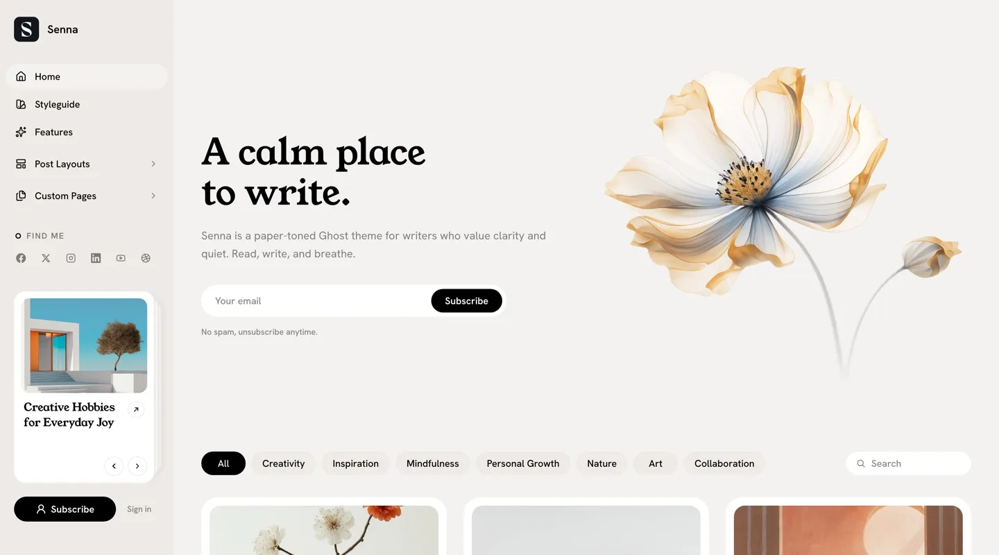
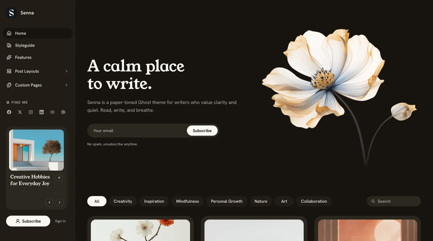
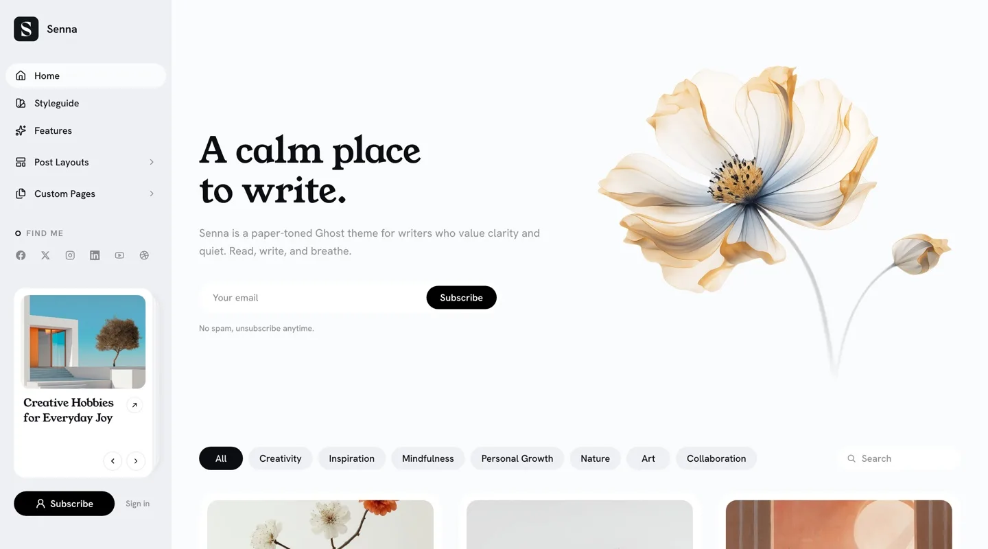
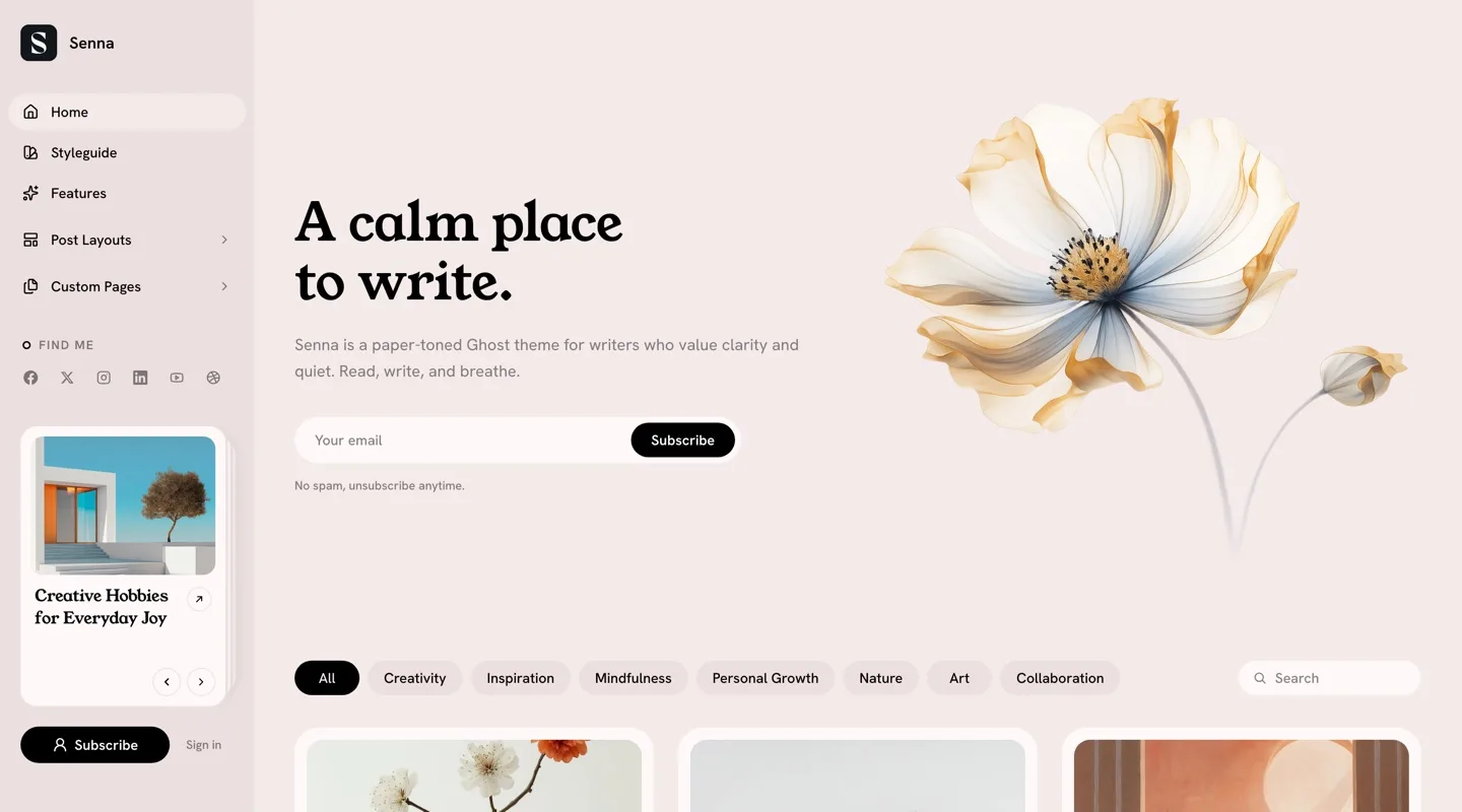
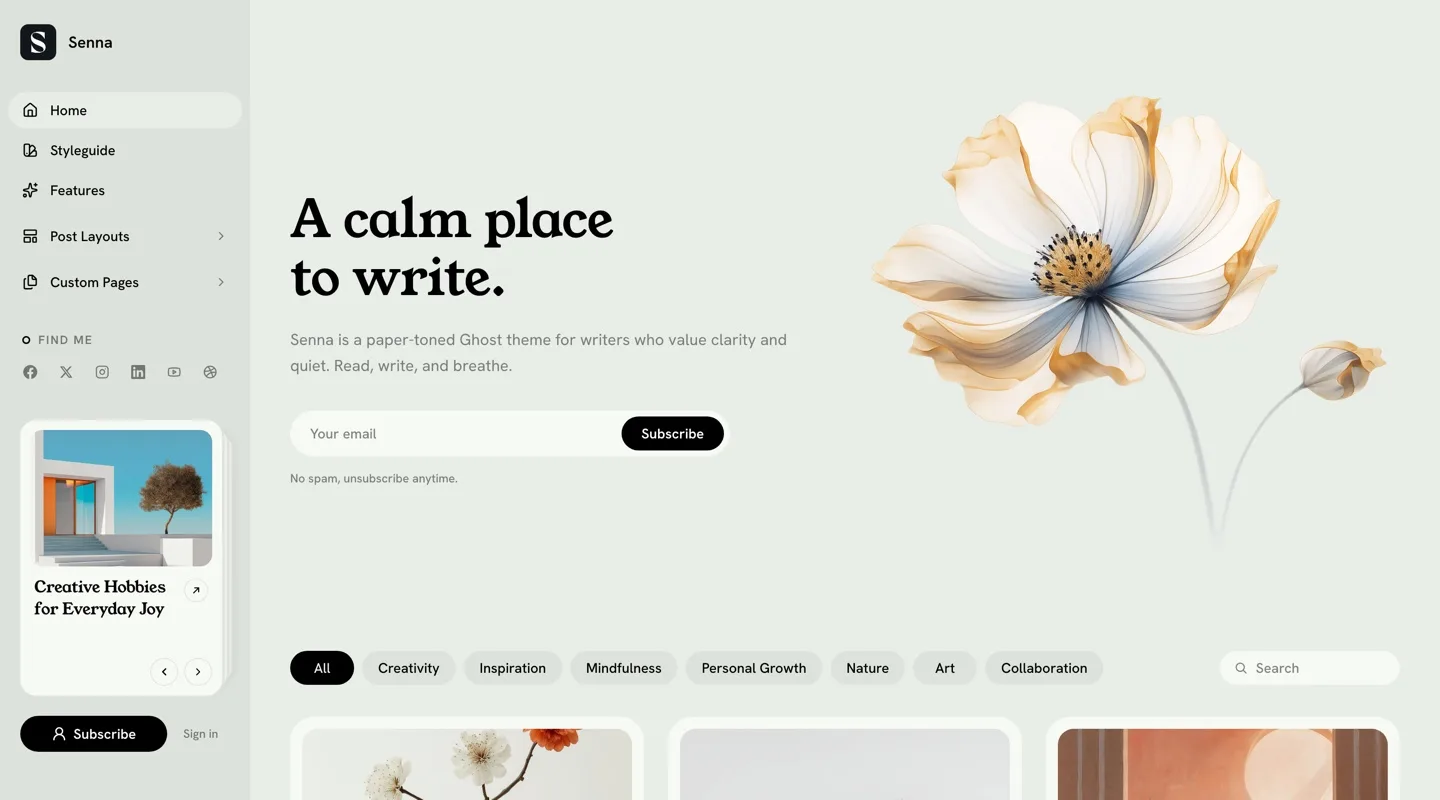
Senna ships seven palettes, all tuned for comfortable reading contrast:
- Default — warm paper, the theme’s home base
- Light — the same structure on cooler, neutral paper
- Blush, Sage, Mist — gently tinted papers (rose, green, blue) that keep the dark ink
- Dark — warm dark paper
- Midnight — a navy dark
- System — follows each visitor’s device setting, switching between Default and Dark
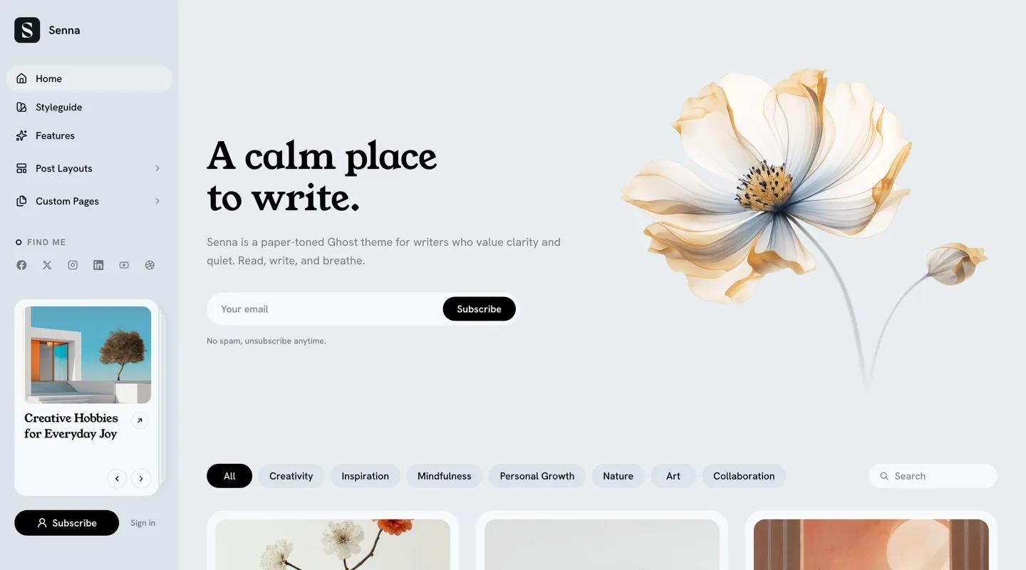
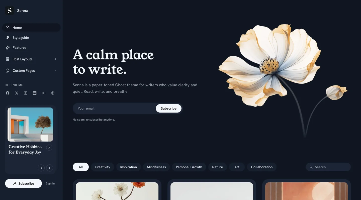
To pick one:
- Go to
Settings>Design & branding>Customize. - Find
Color schemeunder the theme settings. - Choose a scheme.
- Click
Save.
You pick one scheme; there is no visitor-facing toggle. To preview any
scheme without changing the setting, open any page with
?color-scheme=midnight (or any scheme name) appended to the URL. The
preview applies only to that page load and is never persisted.
Brand images in dark schemes: if your logo or site icon disappears
against dark backgrounds, upload alternates under Logo for dark color scheme and Icon for dark color scheme. Both settings appear once a dark
scheme (or System) is selected, and the alternates are shown automatically
in the Dark and Midnight schemes.
Fonts
The defaults are Young Serif for headings and Hanken Grotesk for body text.
Using Ghost Native Fonts
Available in Ghost 5.104.0+:
- Go to
Settings>Design & branding. - Under
Brand, find theTypographysection. - Select your heading and body fonts.
- Click
Save.
Ghost’s native font settings override the theme’s own font settings below.
Using Theme Font Settings
- Go to
Settings>Design & branding>Customize. - Use the
Heading fontandBody fontdropdowns. - Click
Save.
Available Theme Fonts:
| Heading Fonts | Body Fonts |
|---|---|
| Bitter | Bitter |
| Cardo | Fira Mono |
| Chakra Petch | Fira Sans |
| Della Respira | Hanken Grotesk |
| Fira Mono | IBM Plex Serif |
| Fira Sans | Inter |
| Fraunces | JetBrains Mono |
| Hanken Grotesk | Lora |
| IBM Plex Serif | Manrope |
| Inter | Merriweather |
| JetBrains Mono | Noto Sans |
| Libre Baskerville | Noto Serif |
| Lora | Nunito |
| Manrope | Poppins |
| Merriweather | Roboto |
| Noto Sans | Source Serif 4 |
| Noto Serif | Space Mono |
| Nunito | |
| Old Standard TT | |
| Poppins | |
| Roboto | |
| Rufina | |
| Source Serif 4 | |
| Space Grotesk | |
| Space Mono | |
| Tenor Sans | |
| Young Serif |
Fonts load from Bunny Fonts, a privacy-friendly service that doesn’t track your readers. Senna also always loads Source Serif 4 as a supporting family for small editorial details.
Note: Young Serif ships a single weight, which is why Senna’s display headings render at one consistent weight — bold headings won’t get bolder.
Navigation
Primary navigation fills the sidebar on desktop and the Menu sheet on
phones. Secondary navigation renders as the footer’s link columns. Both
are the standard lists under Settings > Navigation.
Two small conventions make the menus richer:
Icons. Append [icon=name] to any label to give it an icon, e.g.
Home [icon=house] or Letters [icon=file-text]. Any
Lucide icon name works. The bracket part never
shows to visitors.
Groups. An item whose URL is just # becomes a group heading, and every
following item whose label starts with - belongs to it:
1. Home (Label: "Home [icon=house]", URL: "/")2. Post Layouts (Label: "Post Layouts", URL: "#") ← Group heading3. - Left Image (Label: "- Left Image", URL: "/left-image-post/")4. - Right Image (Label: "- Right Image", URL: "/right-image-post/")5. About (Label: "About [icon=user]", URL: "/about/")On desktop a group opens as a flyout beside the sidebar; on phones it renders as a titled section inside the Menu sheet; in the footer it becomes a titled column.
Integrated Search:
Ghost’s native search is built in — no configuration needed:
- The search field on the home page
- The Search tab in the bottom bar on phones
- The keyboard shortcut
⌘K(Mac) orCtrl+K(Windows/Linux), anywhere
Social Links
Social links appear in the sidebar’s “Find me” block, in the Menu sheet on phones, and in the footer. The whole block disappears when you have no links set.
Facebook and X (formerly Twitter):
- Go to
Settings>General. - Scroll to
Social accounts. - Enter your Facebook page URL and X profile URL.
- Click
Save.
Other Platforms:
-
Go to
Settings>Code injection. -
In the
Site Headerbox, add one script with the platforms you want:<script>window.social = {instagram: "https://instagram.com/your_username",youtube: "https://youtube.com/@your_channel",linkedin: "https://linkedin.com/in/your_profile",// Add any other network the same way};</script> -
Click
Save.
Use the lowercase platform name as the key and the full profile URL as the value. Any network works. Senna ships dedicated brand icons for Facebook, X, LinkedIn, and WhatsApp; Instagram, YouTube, GitHub, Twitch, Dribbble, Figma, GitLab, CodePen, and Slack get their standard icons; every other network falls back to a neutral link icon. Links open in new tabs.
Author Social Links
Individual authors can show their personal links on author pages and on the Authors page cards:
- Go to
Settings>Staffin Ghost Admin. - Edit an author profile.
- Scroll to the
Social accountssection and fill in the relevant fields. - Click
Save.
Supported fields: Website, Facebook, X (still labeled “Twitter” in Ghost), Instagram, TikTok, YouTube, LinkedIn, Threads, Bluesky, and Mastodon. Networks without a standard icon (TikTok, Threads, Bluesky, Mastodon) show a neutral link icon so nothing renders broken.
Copyright Text
Customize the copyright notice in the footer’s bottom bar:
- Go to
Settings>Design & branding>Customize. - Find
Copyright text. - Enter your text.
- Click
Save.
If left empty, ”© [Year] [Site title]. Published with Ghost.” is displayed.
Post Card Image Aspect Ratio
One setting controls the crop of every card-shaped image on the site — the post grid, the sidebar featured deck, pager cards, and related cards:
- Go to
Settings>Design & branding>Customize. - Find
Post card image aspect ratio. - Choose from 7 options:
16/9,3/2,4/3(default),1/1,4/5,2/3, or9/16. - Click
Save.
Featured Posts
Posts marked as featured appear in a browsable card deck in the desktop sidebar — up to 6, newest first, with previous/next controls.
- Edit a post in Ghost Admin.
- Open post settings (gear icon).
- Toggle
Feature this postON. - Update the post.
With no featured posts, the deck simply doesn’t render.
Subscribe Button
The sidebar’s sign-up button follows Ghost’s Portal customization:
- Go to
Settings>Membership>Portal. - Click
Customize. - Under
Look & feel, set the button text and optionally upload a custom icon image. - Click
Save.
Senna renders your custom button text and custom icon image. Portal’s five built-in icon glyphs are not displayed — the label always stays visible.
Recommended Image Sizes
Upload large originals and let Ghost serve the right size automatically; the full guide lives in Ghost Image Sizes: Best Practices. Senna’s specifics:
| Image | Where it appears | Recommendation |
|---|---|---|
| Post feature image | Post cards, post heroes | At least 2000px wide; cards crop to the Post card image aspect ratio setting (default 4/3) |
Hero image (#hero page) | Homepage hero | At least 2000px wide |
| Publication logo | Sidebar | SVG or transparent PNG; displayed 32px tall |
| Site icon | Menu sheet brand row, share dialog | Square, at least 512×512px |
| Author profile image | Bylines, author pages, Authors page | Square, at least 400×400px |
| Publication cover | Contact page side image fallback | At least 2000px wide |
Homepage Setup
Hero Section
Create the home hero from a regular Ghost page with the #hero tag:
- Create a new page in Ghost Admin.
- Add the internal tag
#hero(type “hash-hero” in the tags field). - Set the page title — this becomes the big serif heading.
- Add content in the editor — this becomes the intro text.
- Optionally add a feature image — it sits framed beside the text.
- Publish the page.
With a feature image the hero runs two columns, text left and photo right;
without one it centers. Without a #hero page, the homepage starts at the
post feed.
Filter Row
The filter row on home and tag pages lists your most-used public tags as pills, with the current tag highlighted. It always keeps to one line; tags that don’t fit fold into a More menu automatically. No configuration needed — it builds itself from your tags.
Subscribe Section
The subscribe sections on the tags index and at the end of every post read
their copy from a page tagged #subscribe:
- Create a new page in Ghost Admin.
- Add the internal tag
#subscribe. - Set the title (the section heading) and a short body (the line under it).
- Optionally add a feature image — the section becomes a photo band with a soft dark overlay.
- Publish the page.
Without this page, a default “Be the first to know” section renders. The subscribe sections only appear when memberships are enabled on your site.
Feeds
The home and archive feeds show 9 posts per batch. Home and tag pages load the next batch with a Load more button; author pages load the next batch automatically as you scroll.
On Phones
Below 1100px the sidebar hands over to a fixed bottom bar with four tabs, the way native apps do it: Home, Search, Menu, and Join (or Account for signed-in members).
- The Join tab opens Ghost’s own sign-up window directly and only appears when memberships are enabled.
- There is no top header — content starts at the top of the screen, and your site icon and title live at the head of the Menu sheet.
- On phones, Menu opens as a bottom sheet: a slide-up panel you can drag closed. On tablet widths — where a full-width sheet would look like a stretched strip — it opens as a compact panel floating just above the bar instead.
- The Menu surface holds your brand, the full primary navigation, and your social links, separated by hairlines.
Installed to a phone’s home screen, Senna keeps the app feel through — including a status bar that matches your color scheme.
The desktop sidebar is unchanged by any of this; on large external displays it floats as a rounded chip beside your content.
Post Settings
Post Layouts
A standard post opens with a clean centered header — kicker, serif title, excerpt, byline — and flows straight into the reading column. The feature image you set appears on cards, feeds, and link previews; to open the post itself with its image, assign one of the image layouts below. Below the content, every post closes with previous/next cards, the subscribe section, comments (if enabled), and a share dialog.
Senna ships 5 post layouts. To apply one:
- Edit a post in Ghost Admin.
- Open post settings (gear icon).
- Under
Template, select the layout. - Click
Update.
| Template | Layout |
|---|---|
| (default) | Centered text-only header — the text leads |
Image Left | Boxed hero panel: header beside the framed image, image on the left |
Image Right | The same panel, image on the right |
Image First | A wide cinematic image leads, header below |
No Image | The default centered header, pinned as an explicit choice |
Video | The first video or embed in your content leads inside a soft tinted panel that also carries the title, byline, and description — the way video platforms lay it out |
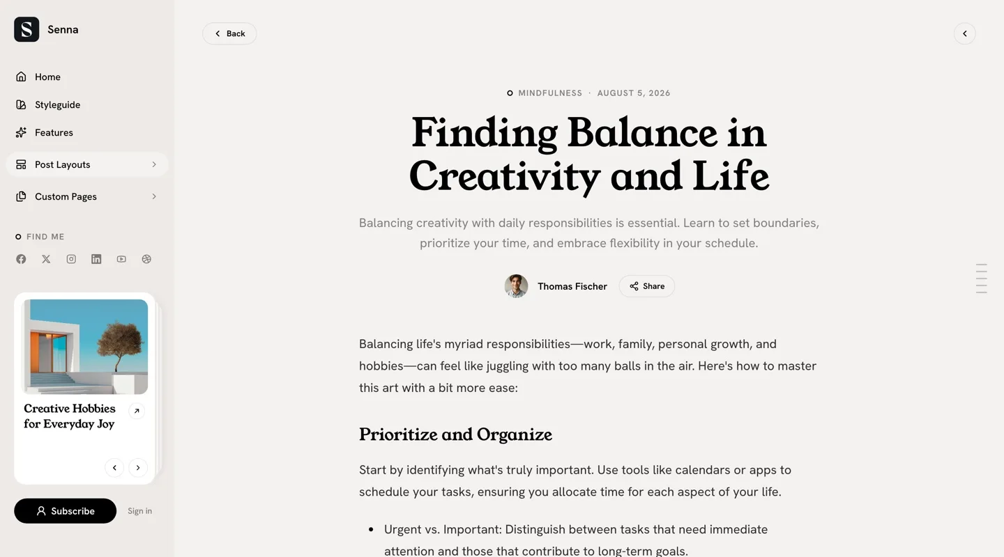
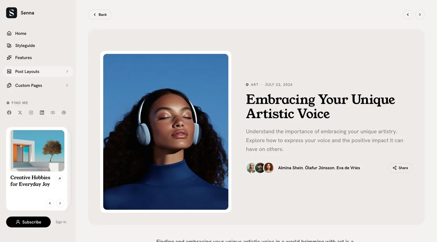
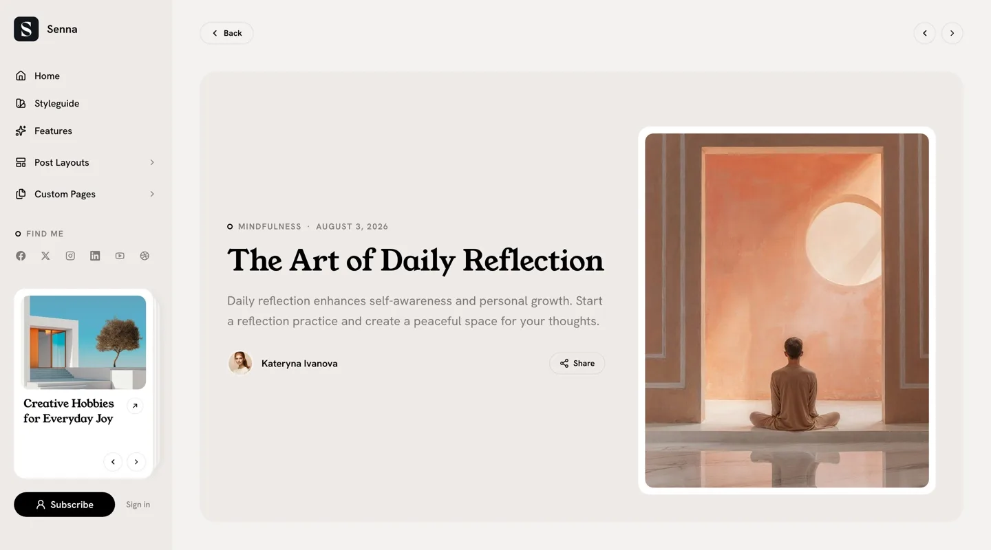
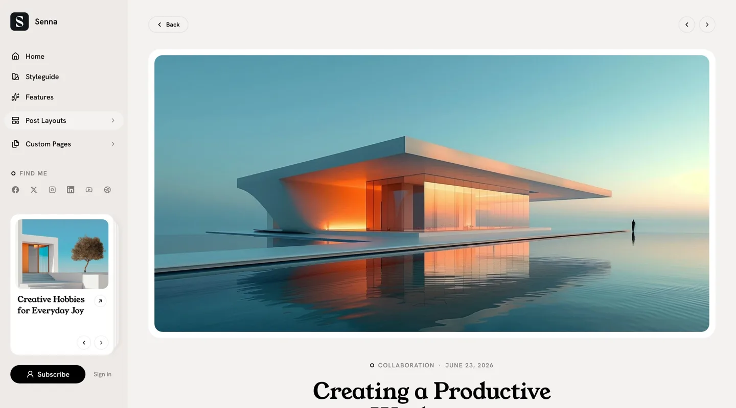
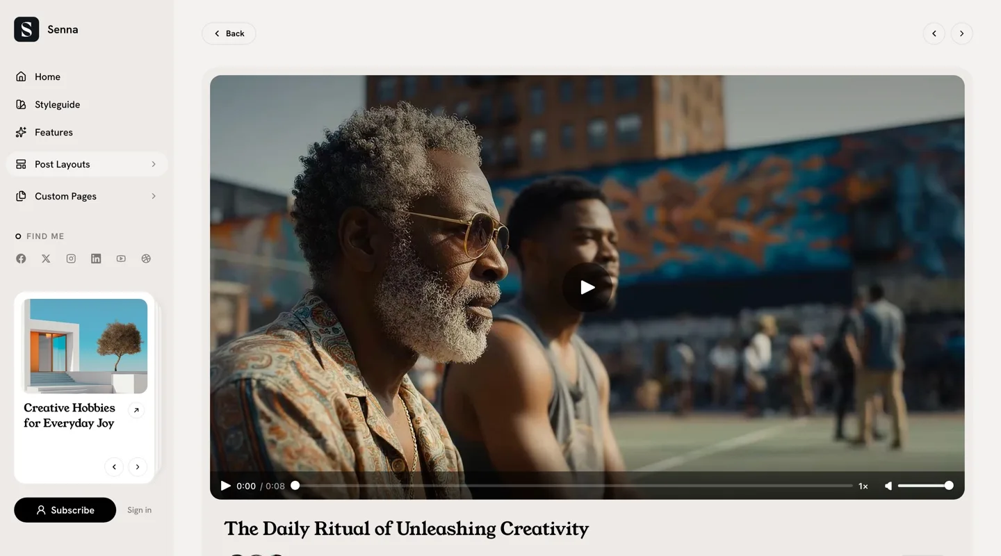
Note: The templates appear in the picker only after the post-install Ghost restart — see Installing the Theme.
Table of Contents
Tag a post #toc and Senna builds a table of contents from your h2 and
h3 headings automatically — no shortcodes, no manual lists:
- A rail of small tick marks sits on the right edge of the screen, one per heading, with the current section highlighted as you read.
- On desktop, hovering or clicking the rail opens the heading list; on phones, tapping it opens a bottom sheet.
- Posts with fewer than two headings show nothing.
Social Sharing
The Share button on every post opens a dialog that leads with a preview card — your post as it would look embedded elsewhere: image, title, excerpt, site name. One row of networks shows first (Facebook, X, LinkedIn); More reveals the rest. A copy-link field sits at the bottom.
On desktop it’s a centered dialog; on tablets a floating panel; on phones a drag-to-close bottom sheet. No configuration needed.
Reading Progress
Posts show a thin accent-colored progress bar along the top of the screen that fills as the reader scrolls. It’s automatic on every post.
Image Lightbox
Images and galleries in post content open in a full-screen lightbox
(powered by PhotoSwipe): click to open, swipe or use arrow keys to
navigate, pinch to zoom on mobile, Esc to close. Captions carry over.
Linked images open their link instead. No configuration needed.
Syntax Highlighting
Code blocks get syntax highlighting automatically (powered by highlight.js). In the light schemes code sits on an ink-dark panel; the Dark and Midnight schemes switch to a matching dark code theme. No configuration needed.
Comments
Enable Ghost’s built-in commenting system and Senna styles the thread to match the theme:
- Go to
Settings>Membership. - Under
Access, clickEditforCommenting. - Choose who can comment (Nobody, All members, Paid members).
- Click
Save.
Page Templates
Create a page, then assign the template under the page’s settings →
Template. The templates appear in the picker only after the post-install
Ghost restart.
| Template | Purpose |
|---|---|
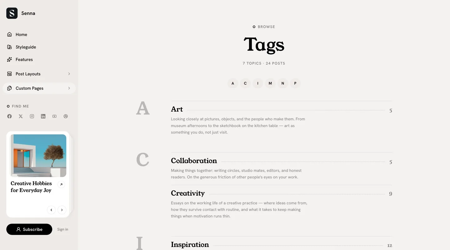
Tags | An editorial A–Z index of every public tag |
Authors | Author cards — avatar, location, bio, post count, social links |
Membership | The pricing page — see Membership Page |
Contact | A contact form — see Contact Page |
Shop | A product grid for Ghost’s product cards — see Shop Page |
Sign In / Sign Up | Chrome-free members auth pages — see Sign In and Sign Up Pages |
Tags Page
An editorial A–Z index of every public tag with posts:
- Create a new page (e.g., title “Topics”).
- Optionally add a custom excerpt — it renders under the title.
- Open page settings and select the
Tagstemplate. - Publish the page, and add it to your navigation.
Each tag renders as a ledger row — its name on a dotted leader to its post
count, description beneath — grouped by letter, with a jump strip at the
top and a topics-and-posts stats line under the header. The #subscribe
section closes the page. For best results, give your tags descriptions
under Tags in Ghost Admin.
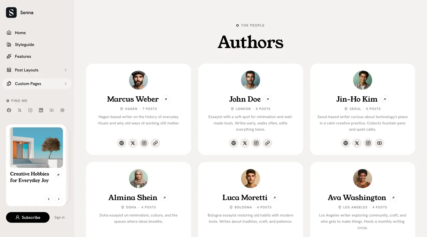
Authors Page
A grid of author cards — every author who has published posts:
- Create a new page (e.g., title “Our Writers”).
- Open page settings and select the
Authorstemplate. - Publish the page.
Each card shows the author’s avatar (when a profile image is set), name,
location, bio, post count, and social links; the card itself links to the
author’s archive. Fill out profiles under Settings > Staff for best
results.
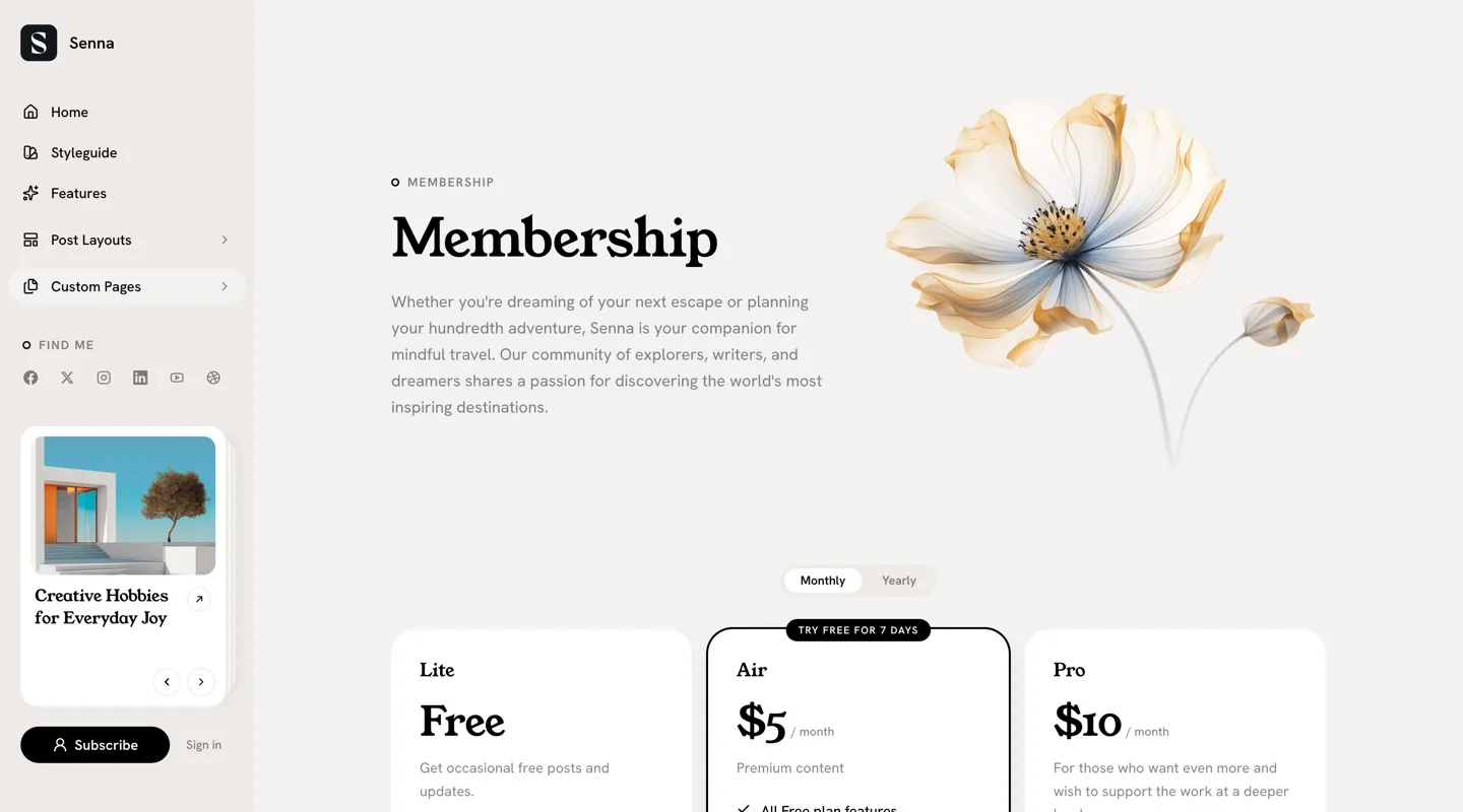
Membership Page
Assign the Membership template to a page and the pricing section fills
itself in from Ghost’s membership settings:
- Create a new page (e.g., title “Become a Member”).
- Optionally add supporting content in the editor — it renders below the pricing, in the reading column. Toggle cards make a natural FAQ, and a blockquote renders as a tinted quote band.
- Open page settings and select the
Membershiptemplate. - Publish the page.
Every visible tier renders as a card: name, monthly/yearly price with a
billing toggle, description, and the tier’s benefits as check rows. Tiers
come from Settings > Membership > Tiers.
Highlighting a plan: give a paid tier a free trial (tier settings → free trial days). That card gets an accent ring, accent buttons, and a “Try free for N days” badge. Without a trial anywhere, the grid stays even — the theme never guesses which plan to promote. Signed-in members see a “Current plan” badge on their own tier.
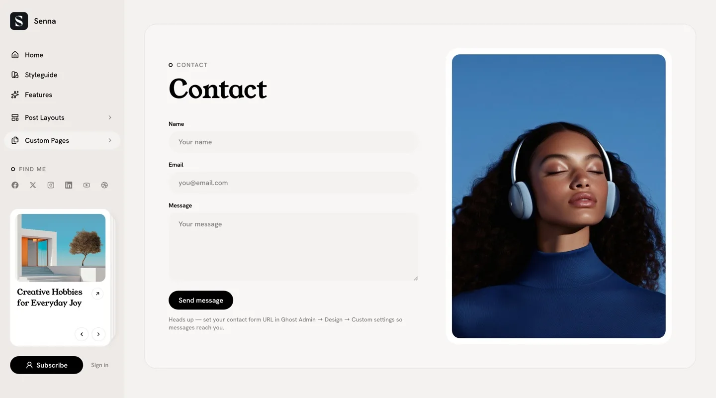
Contact Page
Add a contact form to your site:
- Sign up for a form service like Formspree or Getform and get your form endpoint URL.
- Go to
Settings>Design & branding>Customize. - Find
Contact form URLand paste the endpoint. - Click
Save. - Create a new page (e.g., title “Contact”), add any introductory text,
and select the
Contacttemplate in page settings. - Publish the page.
The page shows your content beside the form; its feature image — or your site cover as a fallback — fills the side column. Until the URL is set, the page explains what’s missing instead of shipping a dead form.
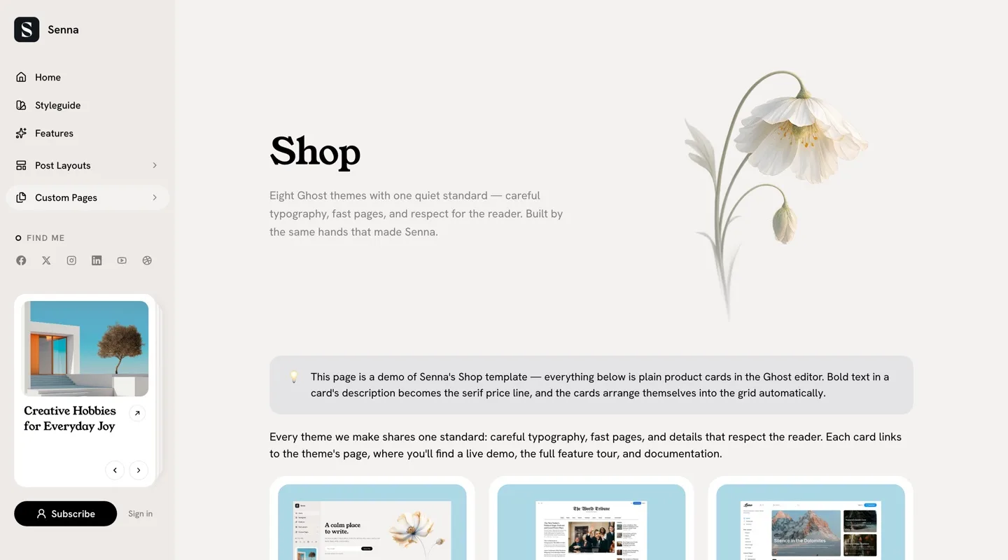
Shop Page
A product grid built from Ghost’s product cards:
- Create a new page (e.g., title “Shop”).
- Add Ghost product cards in the editor (the
+menu → “Product”). - Optionally add a feature image — the page opens with a hero, text left and image right.
- Open page settings and select the
Shoptemplate. - Publish the page.
Product cards arrange themselves into a grid — up to three per row — while any other content (paragraphs, toggles, headings) spans the full width between them. Two conventions, both handled in the editor:
- Bold text in a product’s description renders as the serif price line.
- A product without an image gets a tinted placeholder plate, so a mixed grid stays tidy.
Star ratings recolor to your accent, and product images get the same gentle hover as post cards.
Sign In and Sign Up Pages
By default, Senna uses Ghost’s built-in Portal for sign-in and sign-up — no setup required. To use custom pages instead:
- Create two pages (e.g., “Sign In” and “Join”).
- Assign the
Sign Intemplate to one andSign Upto the other. - Publish both.
- Go to
Settings>Design & branding>Customize. - Toggle
Use custom auth pagesON. - Click
Save.
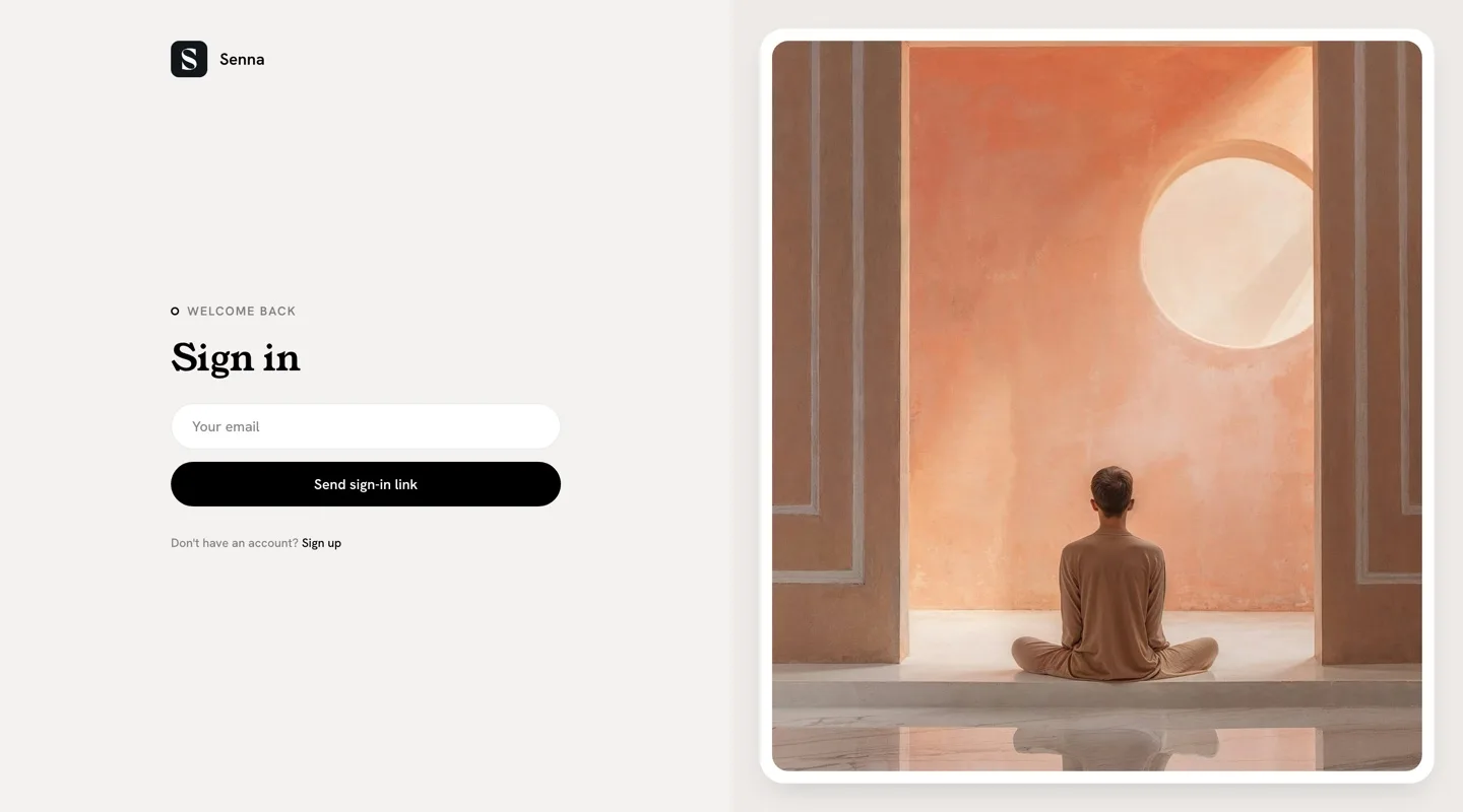
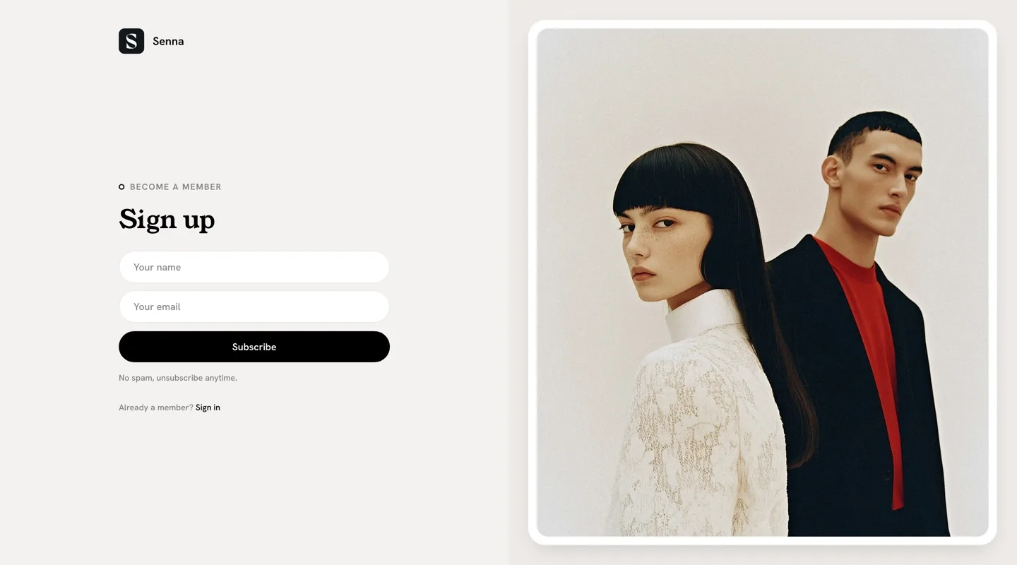
The theme’s sign-in and sign-up links now route to your pages. Both render chrome-free and adapt to their feature image: with one, a 50/50 split with the form beside the photo; without, a centered paper card.
Members Content CTA (Gated Posts)
When a post is restricted to members or paid members, visitors without access see Ghost’s standard call-to-action box in place of the gated content (“This post is for subscribers only”), already styled to match the theme.
That default wording is fixed by Ghost — but you can replace the whole box with your own, using Ghost’s built-in code editor. This lets you write different text per gating case (free members, paid members, specific tiers): for example, making it clear that signing up is free.
The full walkthrough with a paste-ready snippet lives in our guide: Customize the Members CTA on Gated Ghost Posts.
Accessibility
Senna targets WCAG 2.1 AA: every color scheme is tuned for reading contrast, form inputs are labeled, and icon-only controls carry accessible names. Reduced motion is respected throughout — animations, smooth scrolling, and hover effects all stand down when a visitor’s system asks for less motion.
External Services
Senna loads three things from outside your server at runtime. If you run a strict Content Security Policy, allow these origins — without them the related features degrade but nothing breaks:
- fonts.bunny.net — the heading and body fonts
- cdnjs.cloudflare.com — highlight.js, for code syntax highlighting
- cdn.jsdelivr.net — the Lucide icon set used across the interface
Development
Senna is a modern Ghost theme built with:
- Vite for build tooling
- Tailwind CSS v4 for styling
- TypeScript for enhanced JavaScript functionality
- PhotoSwipe for image lightboxes
- Infinite Scroll for content loading
Development Setup
To edit the theme files:
- Download the theme ZIP file from Ghost Admin.
- Unzip the file on your local machine.
- Open the theme folder in your preferred code editor.
You’ll need Node.js 20 or later. Then:
npm installnpm run dev # rebuild on changenpm run build # production build into assets/build/npm run check # type-check the TypeScriptNever edit assets/build/ by hand — it’s generated. Validate with
npx gscan . (the theme stays compatible with Ghost 6.x) and check a real
render in a development Ghost install.
Important Files and Folders
assets/css/: CSS files, includingvariables.cssfor design tokensassets/js/: TypeScript files, including the theme’s web componentspartials/: Reusable Handlebars template partstailwind.config.cjs: Tailwind configurationvite.config.js: Vite build configuration
Remember to test all changes across different devices and browsers before deploying to a live site.
Third Party Materials
These resources helped to make this theme possible. A big thank you to the creators and contributors for their work.
JavaScript && CSS
- PhotoSwipe
- Infinite Scroll
- highlight.js
- Lucide
- Vite
- Tailwind CSS v4
- Tailwind Typography
- Autoprefixer
- PostCSS
Fonts
All selectable theme fonts load from Bunny Fonts.
Support
If you need additional help with the theme, please contact me at support@luxethemes.com.
Good luck with your site!
All the best,
Stefan from LuxeThemes
Changelog
All notable changes to this theme will be documented here
1.0.1
- Various minor improvements
1.0.0
- Initial release of the theme