 Luxe Themes
Reru
Reru is a Ghost theme with an icon rail and a masonry feed. This guide covers installing it, navigation, post layouts, saved posts and membership pages.
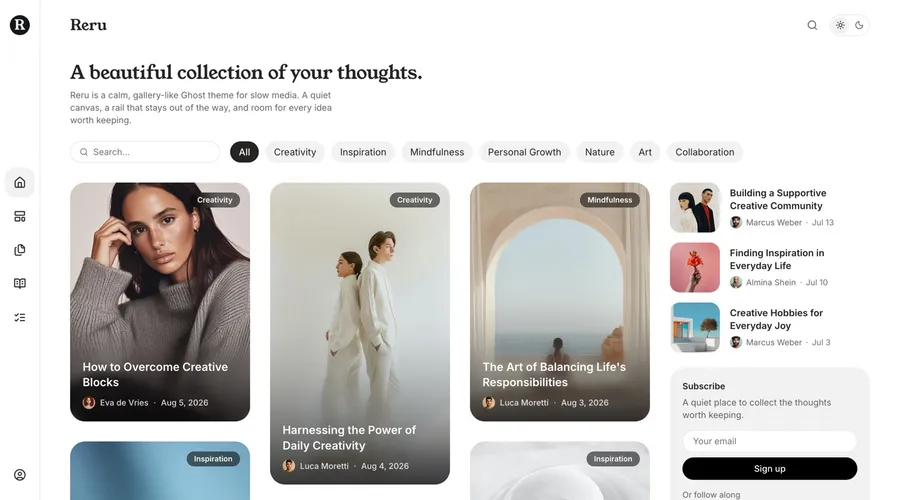
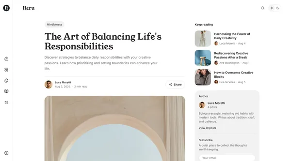
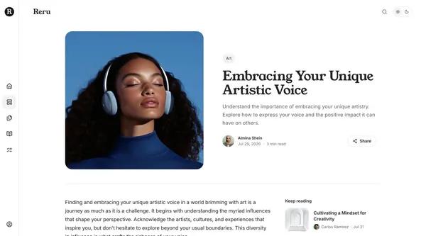
Welcome to Reru. Reru is a Ghost theme for publications whose archive is worth browsing. Instead of a menu across the top, the navigation is a narrow icon rail down the left edge that never widens. Posts sit in a masonry feed at whatever proportions their images have, and a quiet column on the right carries what a reader might want next.
This guide covers installing the theme, setting it up, and what each option changes. Everything in it happens in Ghost Admin, with no code required. The last sections are for developers. If you are new to Ghost, the official Ghost documentation is a good companion.
Requirements: Ghost 5.118 or later, validated against Ghost 6.x.
Installation and Updates
Installing the Theme
- Log in to your Ghost Admin.
- Go to
Settings>Design & branding>Customize. - Click
Change theme(bottom right). - Select
Upload themeand choose theReru.zipfile you downloaded. - Once uploaded, click
Activate. - Restart Ghost once after the first install. Ghost only discovers a
theme’s custom page and post templates at startup, and Reru ships
several. On Ghost(Pro) this happens automatically; on a self-hosted site
run
ghost restart.
If you skip the restart, the templates simply will not appear in the Template dropdown yet. Nothing is broken, and they appear after the next restart.
Removing the Theme
- Go to
Settings>Design & branding>Customize. - Click
Change theme. - Find Reru in the list. Activate a different theme first, because Ghost will not delete the active theme.
- Click the
...menu next to Reru and selectDelete, then confirm.
Updating the Theme
- Download the latest Reru theme zip file.
- Go to
Settings>Design & branding>Customize. - Click
Change theme. - Select
Upload themeand choose the newReru.zipfile. - Activate the updated theme.
Keep your settings when updating. Ghost ties a theme’s settings to the name of the zip file you first uploaded, shown in parentheses under Settings > Theme > Change theme > Installed. Rename the new download to that exact name before uploading, and confirm the overwrite prompt. A different file name, such as one with a version number, installs a second copy of the theme with default settings.
Important: updating overwrites any direct changes you have made to theme files. If you have customized the code, back up your changes before updating.
Recommended Setup Path
Each step below is optional. Reru renders plain content sensibly without any of them, but together they fill in the whole theme.
- Choose an accent color under
Settings>Design & branding. Buttons and links follow it. Black gives the theme its plainest look. - Write the home introduction. Create a page, tag it
#hero, and publish it. See Home Page. - Pick a color scheme and fonts under
Settings>Design & branding>Customize>Theme. See Color Schemes and Fonts. - Build the navigation. Icons and grouped menus are two short conventions. See Navigation.
- Add the pages you want: tags, authors, membership, contact, shop, sign-in and sign-up. Each is a Ghost page with a template assigned. See Page Templates.
- Mark a few posts as featured. They fill the top of the sidebar and the strip above the feed on narrower screens.
How Reru Reads Your Content
Reru composes two things from ordinary Ghost content, selected by internal
tags. Internal tags start with #, and visitors never see them. They exist
only to mark content for the theme.
| Tag | Add it to | What it does |
|---|---|---|
#hero | a page | Becomes the home page introduction. The page title becomes the heading and the page body becomes the paragraph under it. Without this page, the home page shows your site title and description instead. |
#toc | a post | Adds a table of contents built from that post’s headings. See Table of Contents. |
Both conventions degrade quietly. If the tagged page does not exist, the section falls back to sensible defaults or disappears. Nothing breaks.
Language Support
Reru ships with translations for 47 languages plus English. Interface text,
button labels, and form messages all follow your publication language.
Regional variants are included, among them Swiss German (de-CH), Brazilian
Portuguese (pt-BR), and Traditional Chinese (zh-Hant).
- Go to
Settings>General. - Under
Publication language, enter the language code, for exampleesfor Spanish,jafor Japanese, ordefor German. - Click
Save.
Right-to-left languages flip the layout automatically, including the rail and the direction its panels open.
Customization
Accent Color
The accent color drives Reru’s links, buttons, and highlights. Black gives the theme its plainest, most neutral look, which is how the demo is set up.
- Go to
Settings>Design & branding>Customize. - Expand the
Brandsection. - Find
Accent colorand pick your color. - Click
Save.
In the dark scheme a black accent is remapped to near-white automatically, so links and buttons stay visible.
Color Schemes
Reru has two palettes and an option that follows the visitor’s device.
- Default — white page, dark ink.
- Dark — a cool, neutral dark.
- System — Default or Dark, whichever the visitor’s device asks for.
To set it, go to Settings > Design & branding > Customize > Theme and
choose Color scheme.
The visitor switch. A sun-and-moon control sits in the page header, and in
the menu sheet on smaller screens. A visitor’s choice is remembered in their
browser. If you would rather the scheme stayed fixed, turn off
Show color scheme switcher.
Dark brand assets. If your logo or site icon disappears against a dark
background, set Logo for dark color scheme and
Icon for dark color scheme. Reru swaps them in whenever a dark scheme is
showing.
A dark rail on a light site. Use dark color scheme for rail keeps the
navigation rail dark whatever scheme the rest of the page uses. It is a good
way to give a plain white site a defined edge without committing the reading
column to dark.
Fonts
The defaults are Young Serif for headings and Inter for body text. Both are
pickers under Settings > Design & branding > Customize > Theme, with a
range of serif, sans-serif, and monospace faces.
Fonts load from Bunny Fonts, which does not track your readers. Reru also loads Source Serif 4 for quotations inside posts.
If you set fonts in Ghost’s own design settings, those take precedence over the theme’s pickers.
Navigation
Primary navigation fills the rail on desktop and the menu sheet on
smaller screens. Secondary navigation becomes the footer’s link columns.
Both are the standard lists under Settings > Navigation.
Two conventions make the menus richer.
Icons. Add [icon=name] to a label, for example Home [icon=house]. Any
Lucide icon name works, and the bracketed part
never shows to visitors. An item without an icon gets a small tile with the
first letter of its label, so no rail row is ever blank.
Groups. An item whose URL is just # becomes a group heading, and every
following item whose label starts with - belongs to it:
1. Home (Label: "Home [icon=house]", URL: "/")2. Post Layouts (Label: "Post Layouts [icon=layout-template]", URL: "#") ← group3. - Left Image (Label: "- Left Image", URL: "/left-image-post/")4. - Right Image (Label: "- Right Image", URL: "/right-image-post/")5. Features (Label: "Features [icon=list-checks]", URL: "/features/")In the rail a group opens a small panel beside the row. In the menu sheet it becomes a titled section. In the footer it becomes a titled column.
The rail ends with an account row. For a visitor it opens a small panel with Subscribe and Sign in. For a signed-in member it shows their name and plan, then My account and Sign out.
Every page’s header carries a search button, the bookmark that opens the reader’s saved posts, and, from 1100px, the light and dark switch. The bookmark is described under Saved Posts.
Search is Ghost’s own, and needs no configuration. It opens from the
search field on the home page, the search button in the header, and the
keyboard shortcut ⌘K on Mac or Ctrl+K on Windows and Linux.
Social Links
Social links appear beside the subscribe form, in the menu sheet, and on the contact page. The block disappears entirely when you have no links set.
Facebook and X come from Settings > General > Social accounts.
Everything else is one line under Settings > Code injection >
Site header:
<script> window.social = { instagram: "https://instagram.com/you", youtube: "https://youtube.com/@you", linkedin: "https://linkedin.com/company/you" };</script>Reru has brand marks for the common networks and falls back to a plain link icon for anything else.
Author Social Links
Each author’s own links come from their Ghost profile, under Settings >
Staff. Reru shows them on the authors index and on the author card beside a
post. Ghost supports Facebook, X, Threads, Bluesky, Mastodon, TikTok,
YouTube, Instagram, and LinkedIn on a staff profile.
Copyright Text
Copyright text under the theme settings replaces the footer’s copyright
line. Leave it empty and Reru writes © year Site name. Published with Ghost.
Pagination
Pagination style decides how the next posts arrive in a feed:
- Load more — a button under the feed. This is the default.
- Infinite scroll — the next page loads as the reader approaches the end.
Either way, new cards are announced to screen readers as they arrive.
Recommended Image Sizes
Ghost does not tell a theme how tall an image is, so Reru places each card after its image loads and never moves it again. That means any proportion works in the feed, and a set of images with similar proportions reads most calmly.
| Image | Suggested size |
|---|---|
| Post feature image | 1600 × 2000 (portrait) or 2000 × 1333 (landscape) |
| Split hero image (image left or right) | 1200 × 1200, square |
| Image-first hero | 2000 × 1000, wide |
| Page feature image (contact) | 1600 × 1067 |
| Author avatar | 400 × 400 |
| Tag image | 400 × 400 |
Home Page
Hero Section
The home page opens with an introduction. Create a page, tag it #hero, and
publish it. The page title becomes the heading, and its body becomes the
paragraph beneath. Without a #hero page, Reru falls back to your site title
and site description.
The hero page does not need to be linked from anywhere. It exists only to hold the copy.
Filter Row
Below the introduction sits a single row: a search button styled as a field,
an All pill, and a pill for each of your most-used tags. Pills that do not
fit fold into a More menu, so the row stays one line at any width.
The Feed
Posts sit in a masonry of cards. Each card shows its feature image at that image’s own proportions with the title over a softly blurred band, so tall and wide images both work. Posts without a feature image get a tinted plate.
Because Ghost does not publish image dimensions, Reru waits for each image, puts the card in whichever column is shortest at that moment, and then leaves it alone. Nothing that has been placed moves again. The first screen is revealed in one go; after that, cards fade in one at a time as they are placed.
Below 600px the same cards become a compact list of thumbnail, title and byline, matching the rows used in the sidebar.
The Sidebar
From 1280px a 320px column sits beside the feed and carries, in order:
- Featured posts — mark a post as featured in its Ghost settings.
- A subscribe form, with your social links under it.
- Authors — your five most prolific, linking to the authors page when you have one.
- Recommendations — Ghost’s own, when you have any and the feature is on.
Below 1280px the featured posts move above the feed as a strip, and one subscribe band follows the feed. Authors and recommendations are not repeated there.
Tag pages and author pages use the same feed and sidebar.
On Phones
Below 1100px the rail is replaced by a header carrying your logo or site title, a search button, the saved-posts bookmark, and a menu button. The menu opens as a sheet: a drawer you can drag closed on a phone, and a centered panel on a tablet. It is one scrolling list: the primary navigation, then an Account section for members, your social links under Follow, and an Appearance row with the light and dark switch. Visitors see Subscribe and Sign in pinned beneath the list.
The share dialog and the table of contents open the same way.
Reru ships as a progressive web app, so a reader can add your site to a home screen.
Post Settings
A post opens with its tag, the title, the excerpt, and a byline with the author’s avatar and a Share button. The feature image follows, then the text in a 696px reading column.
From 1100px a column beside the text carries three things: Keep reading, the author card, and the subscribe form. Keep reading lists the next and previous posts first, then posts sharing a tag, then featured posts, with duplicates removed. Below 1100px those blocks fall into the flow of the page, after the text.
Post Layouts
Assign a layout under the post’s settings, in the Template dropdown.
Remember to restart Ghost once after installing the theme so the templates
appear there.
| Template | Layout |
|---|---|
| (default) | Header, then the feature image inside the reading column. |
custom-post-image-left | A square feature image and the header side by side above the text, image on the left. |
custom-post-image-right | The same, image on the right. |
custom-post-image-first | A wide image leads across the full content width; the header follows below it. |
custom-post-no-image | The header alone. The feature image still appears on cards and link previews. |
custom-post-video | The first video or embed in the content leads at full width, with the title and byline under it. |
Table of Contents
Tag a post #toc and Reru builds a table of contents from that post’s
headings. It shows as a column of small tick marks at the edge of the screen,
with the current section marked as you read. Hovering or clicking opens the
list of headings. On phones the tick marks sit in the lower corner and open a
sheet.
There are no shortcodes to add, and nothing to configure. Remove the tag and the rail disappears.
Social Sharing
The Share button opens a dialog that leads with a preview of the post: image, title, excerpt, and your site name. Under it sits a row of networks and a copy-link field. On phones it is a bottom sheet; everywhere else a centered dialog.
Saved Posts
Every post carries a bookmark beside the Share button. One tap saves the post: the bookmark fills, and the bookmark in the header counts up. Tapping again removes it.
The header bookmark opens the saved list, a short panel of image and title rows. A row opens the post, the × beside it removes it, and Clear all at the bottom empties the list. The panel shows five posts and a half before it scrolls, so a longer list is easy to spot.
The list is kept in the reader’s browser. It needs no account, it never leaves
their device, and it stays between visits until they clear it. If you would
rather not offer it, turn off Enable saved posts under Settings >
Design & branding > Theme. The bookmark and the header button both
disappear.
Reading Progress
A thin line along the top of the page tracks progress through a post. It starts at the rail’s edge on desktop.
Image Lightbox
Images and galleries inside a post open full screen, with keyboard navigation and pinch-to-zoom. It uses PhotoSwipe.
Syntax Highlighting
Code blocks are highlighted automatically, with a dark code theme that follows the color scheme. Add a language to the code block in the Ghost editor for the best result.
Comments
Ghost’s native comments render in a tinted panel at the end of a post. Turn
them on under Settings > Access > Commenting.
Page Templates
Create a page, then assign the template under the page’s settings, in the
Template dropdown.
| Template | Purpose |
|---|---|
custom-tags | Every public tag as a row: image, name, post count, description, and its three latest posts. |
custom-authors | A card for each author with posts: avatar, name, location, post count, bio, social links. |
custom-membership | The pricing page. See Membership Page. |
custom-contact | A contact form. See Contact Page. |
custom-shop | A product grid built from Ghost’s product cards. See Shop Page. |
custom-sign-in, custom-sign-up | Members sign-in and sign-up pages without the site chrome. |
Give these pages a title and a page excerpt and both render at the top, left-aligned like the home and tag headers. The tags and authors indexes show a count line under the title.
Tags Page
Assign custom-tags to a page. Every public tag becomes a ledger row with its
name, post count, description, and thumbnails of its three latest posts. A tag
with a feature image shows it at the start of the row; a tag without one
starts with its name. Tags with no posts are left out.
Authors Page
Assign custom-authors. Every author with at least one post gets a centered
card: avatar, name, location, post count, bio, and social links. Authors
without posts are left out.
Membership Page
Assign custom-membership and the pricing grid fills itself from your Ghost
membership settings. Every visible tier becomes a card with its name, monthly
and yearly prices behind a billing toggle, description, and benefits.
To draw attention to one plan, give a paid tier a free trial in its tier settings. That card gets an emphasis ring and a trial chip. Without a trial the grid stays even, because the theme does not guess which plan to promote. A signed-in member sees their own tier marked as the current plan.
If your site’s subscription access is invite-only, Reru hides every sign-up and subscribe control across the whole theme and shows sign-in only. The sign-up page falls back to the sign-in form. Signed-in members do not see subscribe forms.
The page’s own content renders below the grid. Toggle cards make a natural FAQ there, and Reru renders them as a flush hairline accordion.
Contact Page
Assign custom-contact and set the Contact form URL theme setting to a form
endpoint. Services such as Formspree give you one.
With a feature image the page puts your title, text, and image on the left and a name, email, and message form on the right. Without a feature image it becomes a single centered column, and nothing else changes.
Until the URL is set, the page explains what is missing rather than showing a form that goes nowhere.
Your page content renders as a ruled ledger between the description and the image, which suits a short list of addresses or hours.
Shop Page
Assign custom-shop and write the page with Ghost’s product cards. The page
opens with the same left-aligned title and excerpt as the home page, with the
feature image beside them when there is one. The cards arrange themselves into
a grid, two per row on a tablet and four on a desktop, and any other block sits
between them on a comfortable reading width.
Bold text at either end of a product description becomes the price line: its own line under a hairline when it leads, and over one when it trails. Keep other emphasis in the middle of a sentence so it is not mistaken for a price. The star rating shares that line, sitting at its far end, and the buy button follows on a row of its own. Write the description as a single paragraph to get this: split it in two and the rating falls back to a line of its own. A product without an image gets a tinted plate so the grid stays even.
Sign In and Sign Up Pages
Assign custom-sign-in and custom-sign-up to two pages, then turn on the
Use custom auth pages theme setting. Sign-in and sign-up links across the
theme then point at your pages instead of Ghost’s popup.
With a feature image the photo fills the page and the form sits in a card centered on top of it. The image caption, if you set one, sits in a bottom corner over the photo. On a phone the card gives up its margins: the photo becomes a band across the top and the form runs flush beneath it. Without a feature image the same form centers on the plain page with no card at all.
Members Content CTA
On a post gated to members, Ghost injects its own call to action where the content stops. Reru styles it to match the rest of the theme.
Accessibility
Reru targets WCAG 2.1 AA. Both color schemes are tuned for reading contrast, form inputs are labeled, icon-only controls carry accessible names, and headings run in order. A “Skip to content” link is the first thing a keyboard reaches.
The rail is reachable by keyboard, and because a row reveals its label on focus as well as on hover, it also works on a touchscreen without a separate mode.
Reduced motion is respected throughout. Animations and smooth scrolling stand down when a visitor’s system asks for less.
Without JavaScript the primary navigation still renders as a plain list and every page keeps its content. The rail’s panels, the menu sheet, the masonry placement, and the dialogs need JavaScript.
External Services
Reru loads three things from outside your server at runtime. If you run a strict Content Security Policy, allow these origins. Without them the related feature degrades, but nothing else breaks:
- fonts.bunny.net — the heading and body fonts
- cdnjs.cloudflare.com — highlight.js, for code syntax highlighting
- cdn.jsdelivr.net — the Lucide icon set used across the interface
Development
Reru is built with:
- Vite for build tooling
- Tailwind CSS v4 for styling
- TypeScript for the theme’s behavior
- PhotoSwipe for image lightboxes
- Infinite Scroll for feed loading
Development Setup
- Download the theme ZIP file from Ghost Admin.
- Unzip it on your machine.
- Open the folder in your editor.
You will need Node.js 20 or later. Then:
npm installnpm run dev # rebuild on changenpm run build # production build into assets/build/npm run check # type-check the TypeScriptNever edit assets/build/ by hand, because it is generated. Validate with
npx gscan . and check a real render in a development Ghost install.
Important files and folders
assets/css/— CSS, includingvariables.cssfor the design tokensassets/css/components/rail.css— the rail’s hover and focus behaviorassets/css/components/loop.css— both post card compositions and the feedassets/js/— TypeScript, including the theme’s web componentspartials/— reusable Handlebars template partstailwind.config.cjsandvite.config.js— build configuration
Test changes across devices and browsers before deploying to a live site.
Third Party Materials
These resources helped make this theme possible. Thank you to their creators and contributors.
JavaScript and CSS
- PhotoSwipe
- Infinite Scroll
- highlight.js
- Lucide
- Vite
- Tailwind CSS v4
- Tailwind Typography
- Autoprefixer
- PostCSS
Fonts
All selectable theme fonts load from Bunny Fonts.
Support
If you need more help with the theme, contact us at support@luxethemes.com.
Good luck with your site.
All the best,
Stefan from LuxeThemes
Changelog
All notable changes to this theme are documented here.
1.0.1
- Tags and authors page headers now align left, matching every other page
- The shop’s star rating sits on the price line instead of a line of its own
- The shop’s buy button moved to its own row under the price
- Tightened the spacing between shop FAQ rows
1.0.0
- Initial release of the theme