 Luxe Themes
Luno Theme Documentation
Welcome to Luno! This guide helps you install, customize, and get the most out of your new Ghost theme. If you’re new to Ghost, you might find the official Ghost documentation helpful.
Installation and Updates
Installing the Theme
Follow these steps to add Luno to your Ghost site:
- Log in to your Ghost Admin.
- Go to
Settings>Design & branding>Customize. - Click
Change theme(bottom right). - Select
Upload themeand choose theLuno.zipfile you downloaded. - Once uploaded, click
Activate.
Removing the Theme
If you need to remove Luno:
- Go to
Settings>Design & branding>Customize. - Click
Change theme. - Find Luno in the list. Before deleting, activate a different theme (you can’t delete an active theme).
- Click the
...menu next to Luno and selectDelete. Confirm the deletion.
Updating the Theme
Keep Luno up-to-date with the latest features and improvements:
- Download the latest version of the Luno theme zip file.
- Go to
Settings>Design & branding>Customize. - Click
Change theme. - Select
Upload themeand choose the newLuno.zipfile. - Activate the updated theme.
Important: Updating overwrites any direct code changes you’ve made to theme files. If you’ve customized the code, back up your changes before updating.
Customization
Logo
Set your site’s logo for branding:
- Go to
Settings>Design & branding. - Under
Brand, findPublication logo. - Click
Upload logoand select your image file. Use a transparent background (like.png) for best results. - Click
Save.
If you plan to use dark mode (see Color Scheme section), you can add a separate logo optimized for dark backgrounds:
- Go to
Settings>Design & branding>Customize. - Find
Logo for dark color schemeunderSite-wide. - Upload your dark mode logo variant.
- Click
Save.
Copyright Text
Customize the copyright notice shown in your site footer:
- Go to
Settings>Design & branding>Customize. - Find
Copyright text. - Enter your desired copyright information (e.g.,
© 2024 Your Site Name. All rights reserved.). - Click
Save.
If left empty, the default ”© [Year] Published with Ghost” will be displayed.
Color Scheme
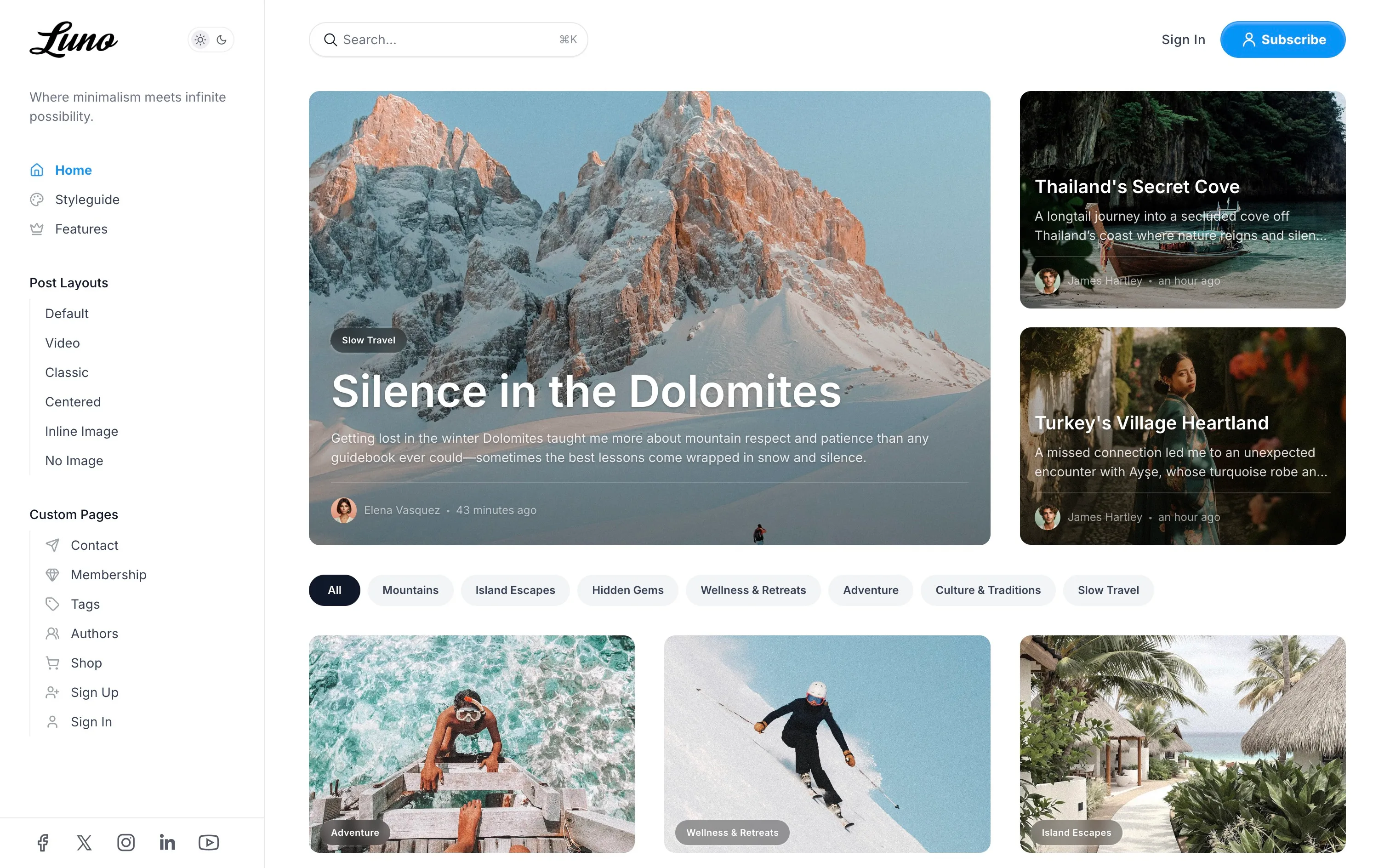
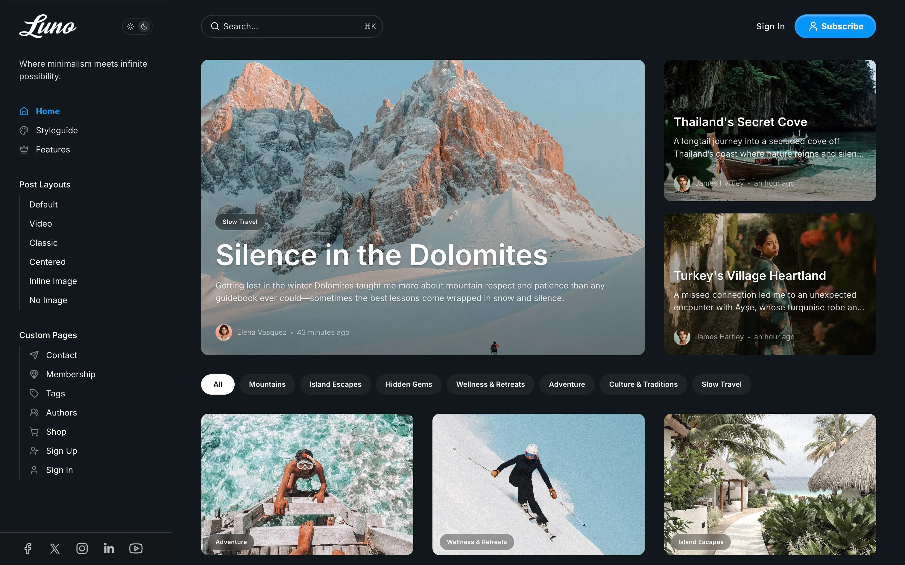
Choose how your site handles light and dark modes:
- Go to
Settings>Design & branding>Customize. - Expand the
Site-widesection. - Find
Color schemeand choose:- Light: Always use the light theme.
- Dark: Always use the dark theme.
- System: Automatically match the visitor’s device setting.
- Click
Save.
You can also allow visitors to switch modes themselves:
- Find
Show color scheme switcherunderSite-wide. - Toggle it on to display a switcher button in the header.
- Click
Save.
Fonts
Luno integrates with Ghost’s native font system and also includes built-in options.
Using Ghost Native Fonts (Recommended)
Available in Ghost 5.104.0+, this method provides the best control and consistency:
- Ensure you’re using a recent version of Luno and Ghost.
- Go to
Settings>Design & branding. - Under
Brand, find theTypographysection. - Select your desired heading and body fonts.
- Click
Save.
These settings automatically override the theme’s specific font settings.
Using Theme Font Settings
If you prefer not to use Ghost’s native system:
- Go to
Settings>Design & branding>Customize. - Expand the
Site-widesection. - Use the
Heading font familyandBody font familydropdowns to select fonts. - Click
Save.
Available Theme Fonts:
| Heading Fonts | Body Fonts |
|---|---|
| Bitter | Bitter |
| Cardo | Fira Mono |
| Chakra Petch | Fira Sans |
| Della Respira | IBM Plex Serif |
| Fira Mono | Inter |
| Fira Sans | JetBrains Mono |
| Fraunces | Lora |
| IBM Plex Serif | Manrope |
| Inter | Merriweather |
| JetBrains Mono | Noto Sans |
| Libre Baskerville | Noto Serif |
| Lora | Nunito |
| Manrope | Poppins |
| Merriweather | Roboto |
| Noto Sans | Source Serif 4 |
| Noto Serif | Space Mono |
| Nunito | |
| Old Standard TT | |
| Poppins | |
| Roboto | |
| Rufina | |
| Source Serif 4 | |
| Space Grotesk | |
| Space Mono | |
| Tenor Sans |
Social Media Links
Display social media icons in your site footer:
Facebook and X (formerly Twitter):
- Go to
Settings>General. - Scroll to
Social accounts. - Enter your Facebook page URL and X profile URL.
- Click
Save.
Other Platforms (Instagram, LinkedIn, etc.):
- Go to
Settings>Code injection. - In the
Site Headerbox, add the following script, modifying the links and adding platforms as needed:
<script> // Add links for the social platforms you want to display window.social = { instagram: "https://instagram.com/your_username", linkedin: "https://linkedin.com/in/your_profile", youtube: "https://youtube.com/your_channel", pinterest: "https://pinterest.com/your_username", // Add other supported platforms below };</script>- Click
Save.
Supported Platforms for Code Injection:
Use the lowercase platform name as the key (e.g., instagram, linkedin).
| Behance | ||
| Bluesky | Flickr | |
| Deezer | Snapchat | |
| Diaspora | Kickstarter | Spotify |
| Discord | Line | Telegram |
| Dribbble | Threads | |
| Mastodon | TikTok | |
| OK | Twitch | |
| Patreon | Vimeo | X |
| YouTube | Yelp | |
| Zhihu |
Author Social Links
Individual author profiles can display their personal social media links on author pages and in author bio sections:
Adding Social Links to Author Profiles:
- Go to
Settings>Staffin Ghost Admin. - Edit an author profile.
- Scroll to the
Social accountssection. - Fill in the relevant social platform fields.
- Click
Save.
Supported Platforms for Authors:
Authors can add links to these platforms directly in their Ghost profile:
| Platform | Field Name | Notes |
|---|---|---|
| Website | Website | Any personal or professional website |
| Facebook profile/page username | ||
| X (Twitter) | X.com username (still labeled “Twitter” in Ghost) | |
| Instagram username | ||
| TikTok | TikTok | TikTok username |
| YouTube | YouTube | YouTube channel URL or username |
| LinkedIn profile URL | ||
| Threads | Threads | Threads username |
| Bluesky | Bluesky | Bluesky handle |
| Mastodon | Mastodon | Full Mastodon profile URL |
Where Author Social Links Appear:
- Author archive pages (
/author/username/) - Author bio sections within posts
- The Authors listing page (if using the Authors template)
Author social links appear as icons with tooltips and open in new tabs when clicked.
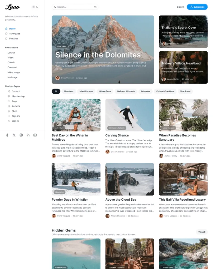
Primary Navigation (Sidebar)
The main navigation appears in a sidebar that opens on both desktop and mobile. This is your site’s primary navigation system.
- Go to
Settings>Navigation. - Edit items under
Primary navigation. - Add menu items with optional icons and submenus.
Navigation Item Formatting:
Basic Items:
- Label:
Home→ Displays as “Home” - URL:
/→ Links to homepage
Items with Icons:
- Label:
[icon=home] Home→ Displays with home icon + “Home” - Label:
[icon=user] About→ Displays with user icon + “About”
Creating Group Headers and Sub-items:
- Group Header: Set URL to
#(e.g., Label:Company, URL:#) - Sub-items: Add a
-prefix to the label (e.g., Label:-About Us, URL:/about)
Example Navigation Structure:
1. Home (Label: "Home", URL: "/")2. Company (Label: "Company", URL: "#") ← Group Header3. -About Us (Label: "-About Us", URL: "/about") ← Sub-item4. -Contact (Label: "-Contact", URL: "/contact") ← Sub-item5. Blog (Label: "Blog", URL: "/blog")Use any icon name from the Lucide icon library (e.g., home, user, mail, phone, calendar).
Sidebar Background Image:
- Go to
Settings>Design & branding>Customize. - Under
Site-wide, findSidebar menu background image. - Upload an image for the sidebar background.
- Click
Save.
Integrated Search:
Ghost’s native search is automatically integrated into your navigation:
- Desktop: Search icon appears in the sidebar
- Mobile: Search icon in the header
- Keyboard Shortcut: Press
⌘K(Mac) orCtrl+K(Windows/Linux) to open search from anywhere - Searches titles, content, authors, and tags
- No configuration needed - works automatically
Secondary Navigation (Footer)
Configure the links displayed in your site footer, organized into columns:
- Go to
Settings>Navigation. - Edit items under
Secondary navigation. - To create columns:
- Add a column header item (e.g.,
Company). Set its URL to#. - Add the links for that column directly below the header (e.g.,
About Us,Contact). - Add another header item with URL
#to start the next column (e.g.,Legal). - Add links for the second column below its header (e.g.,
Privacy Policy,Terms of Service).
- Add a column header item (e.g.,
- Click
Save.
Subscribe Button
The subscribe button in the header can be customized through Ghost’s Portal settings.
- Go to
Settings>Membership>Portal. - Click
Customize Portal. - Under
Look & feel, find the button customization options:- Button style: Choose between icon only, text only, or icon + text
- Button icon: Select from 5 built-in icons or upload a custom icon
- Button text: Set custom text (default is “Subscribe”)
- Click
Save.
Homepage Setup
Hero Section
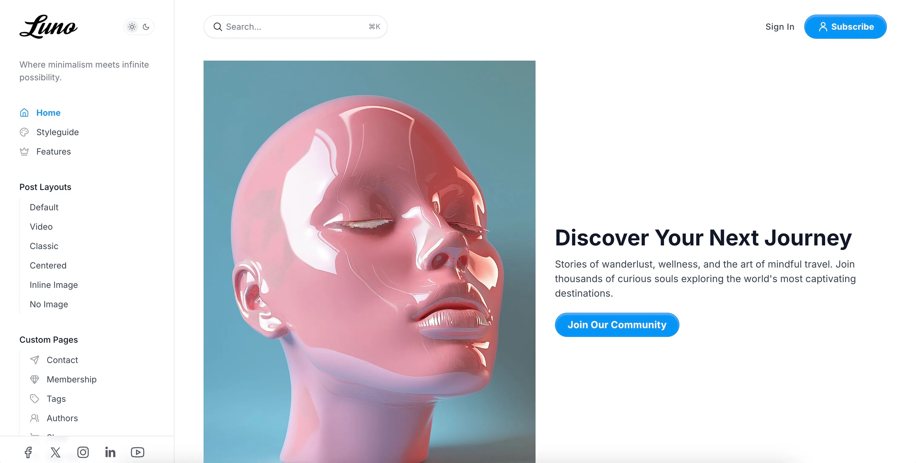
Create an eye-catching hero section on your homepage using a Ghost page with the #hero tag.
Setup:
- Create a new page in Ghost Admin.
- Add the internal tag
#hero(type “hash-hero” in the tags field). - Set the page title (this becomes your hero heading).
- Add content in the editor (this becomes your hero body text - full HTML/markdown supported).
- Optionally add a feature image.
- Publish the page.
Customization:
Go to Settings > Design & branding > Customize > Homepage section:
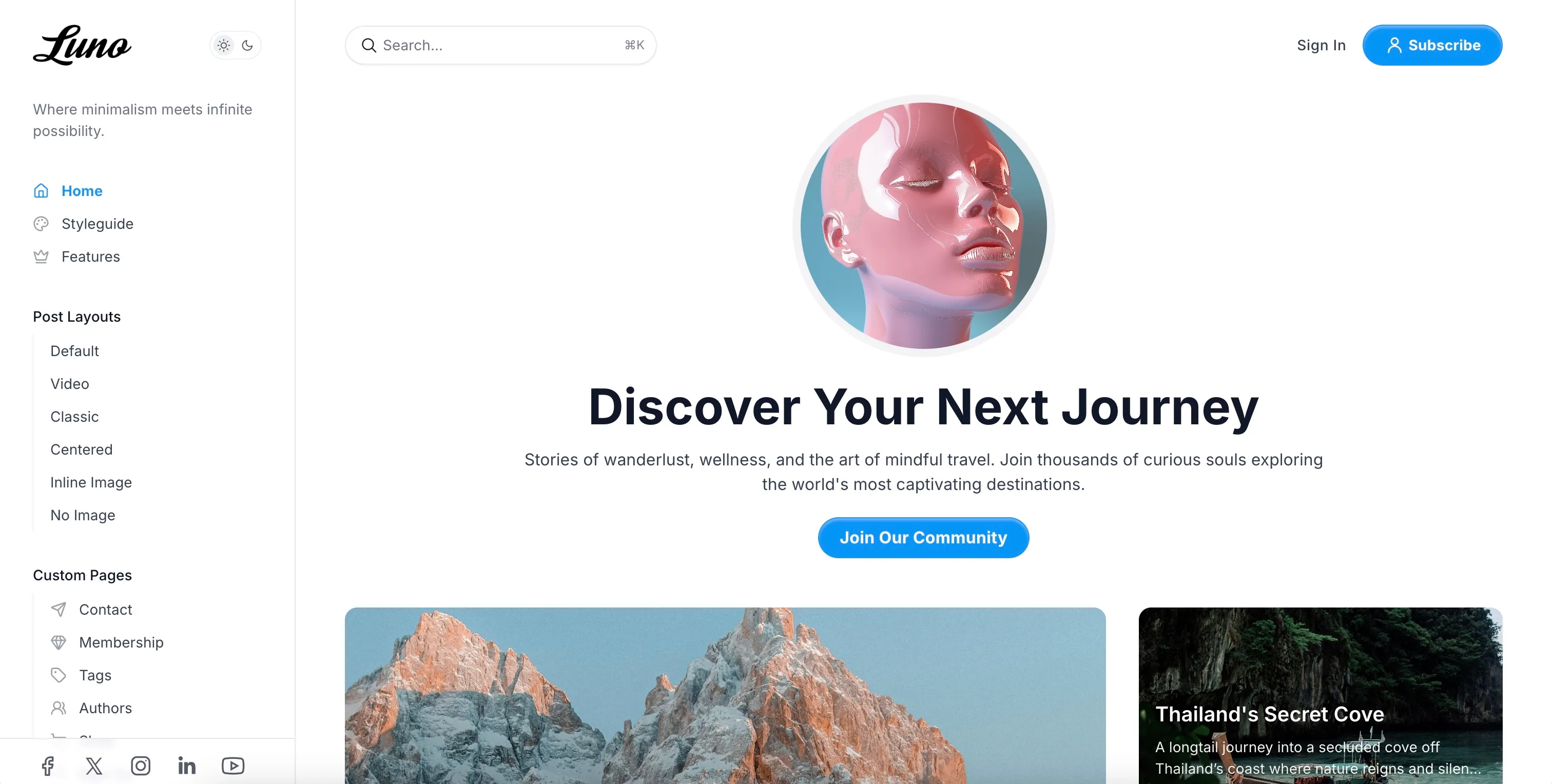
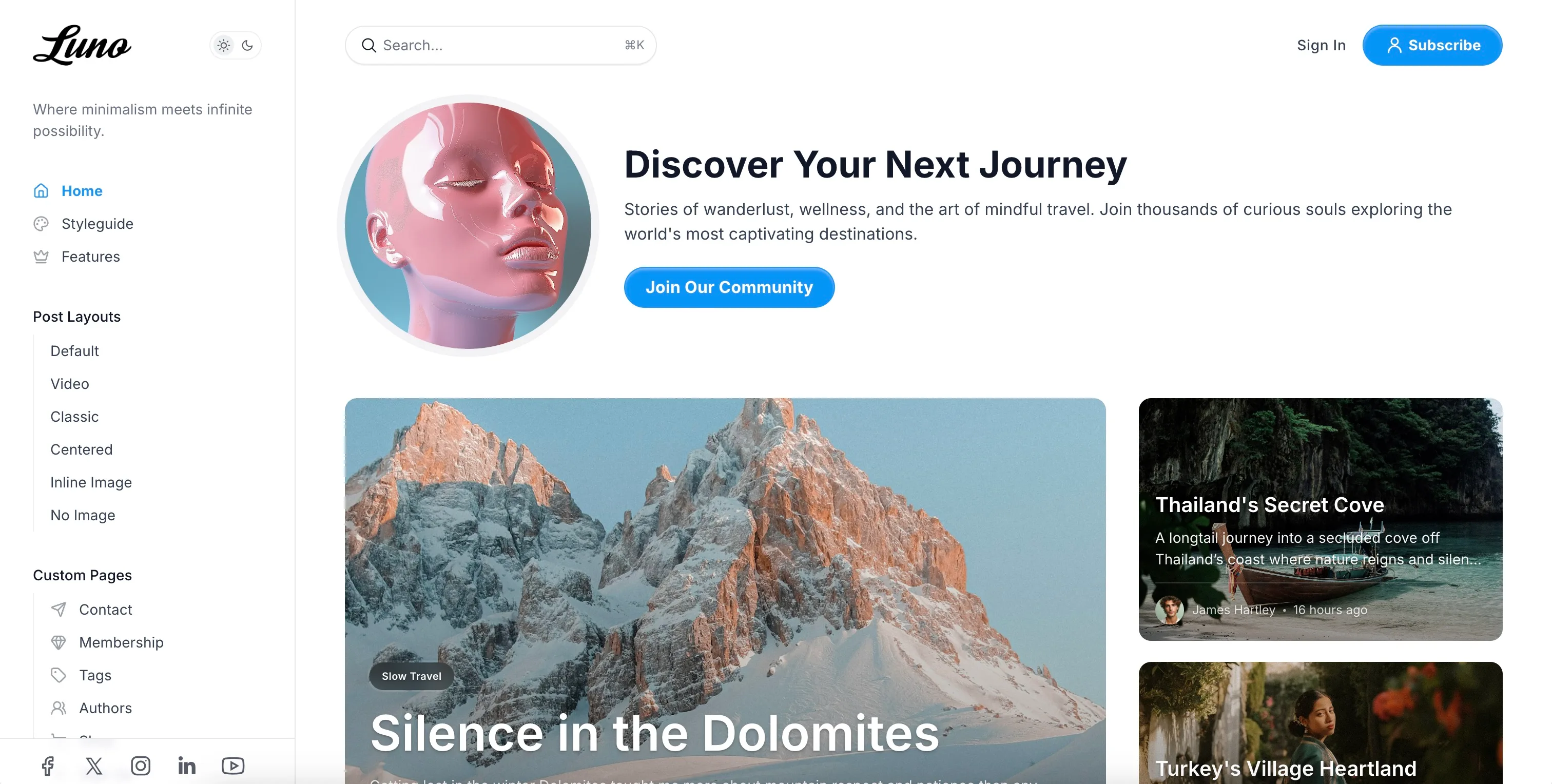
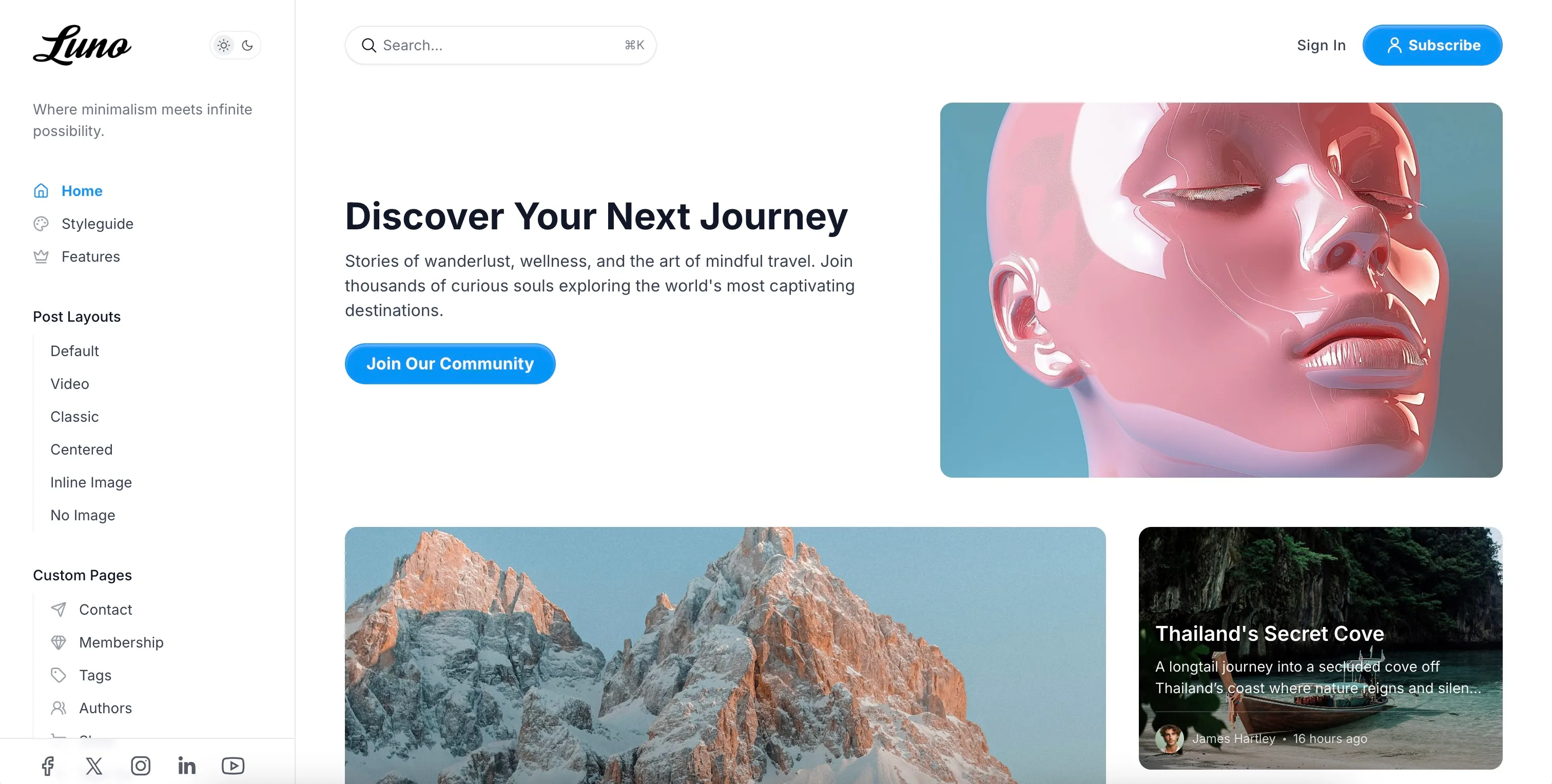
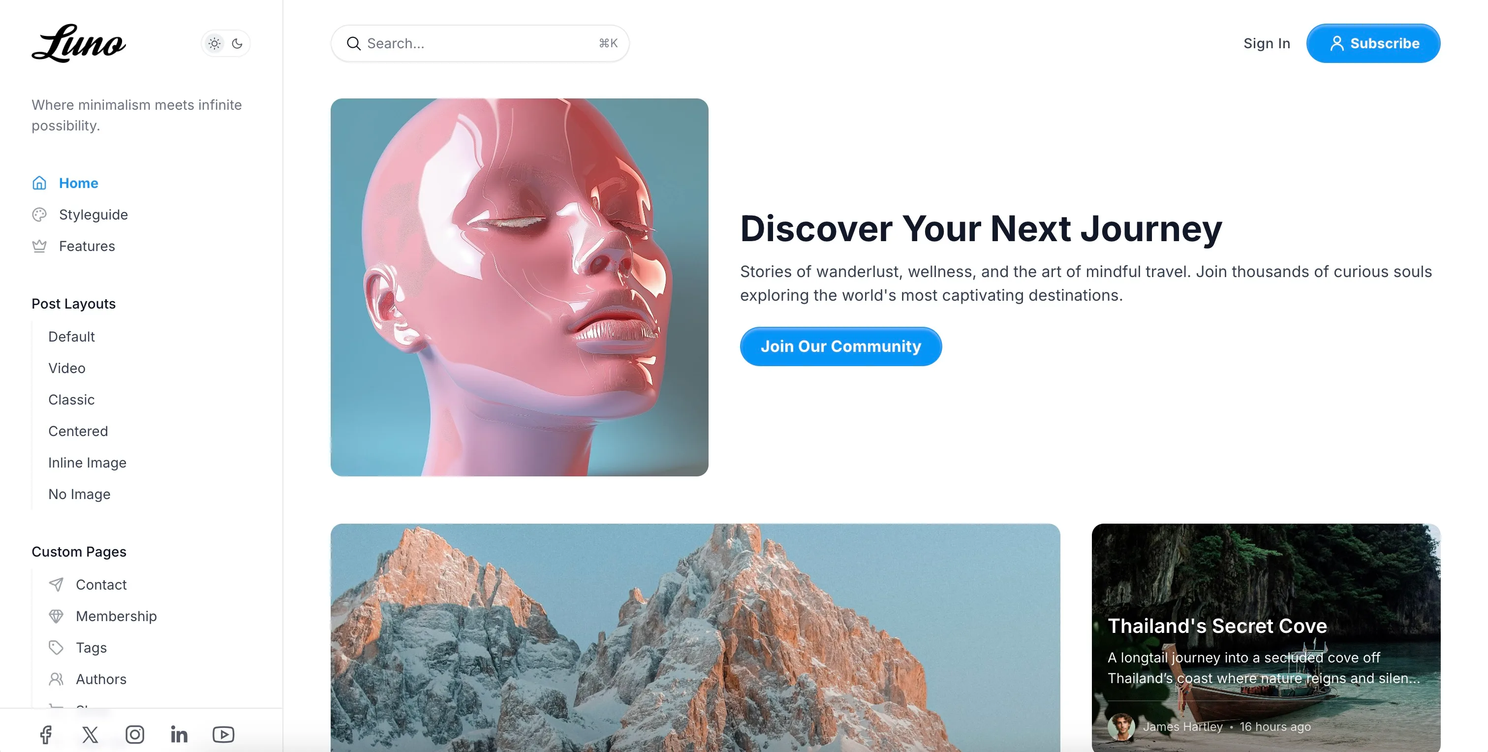
Hero Layout Options:
- default - Standard layout with content and image side by side
- centered - Centered layout with image above or below content
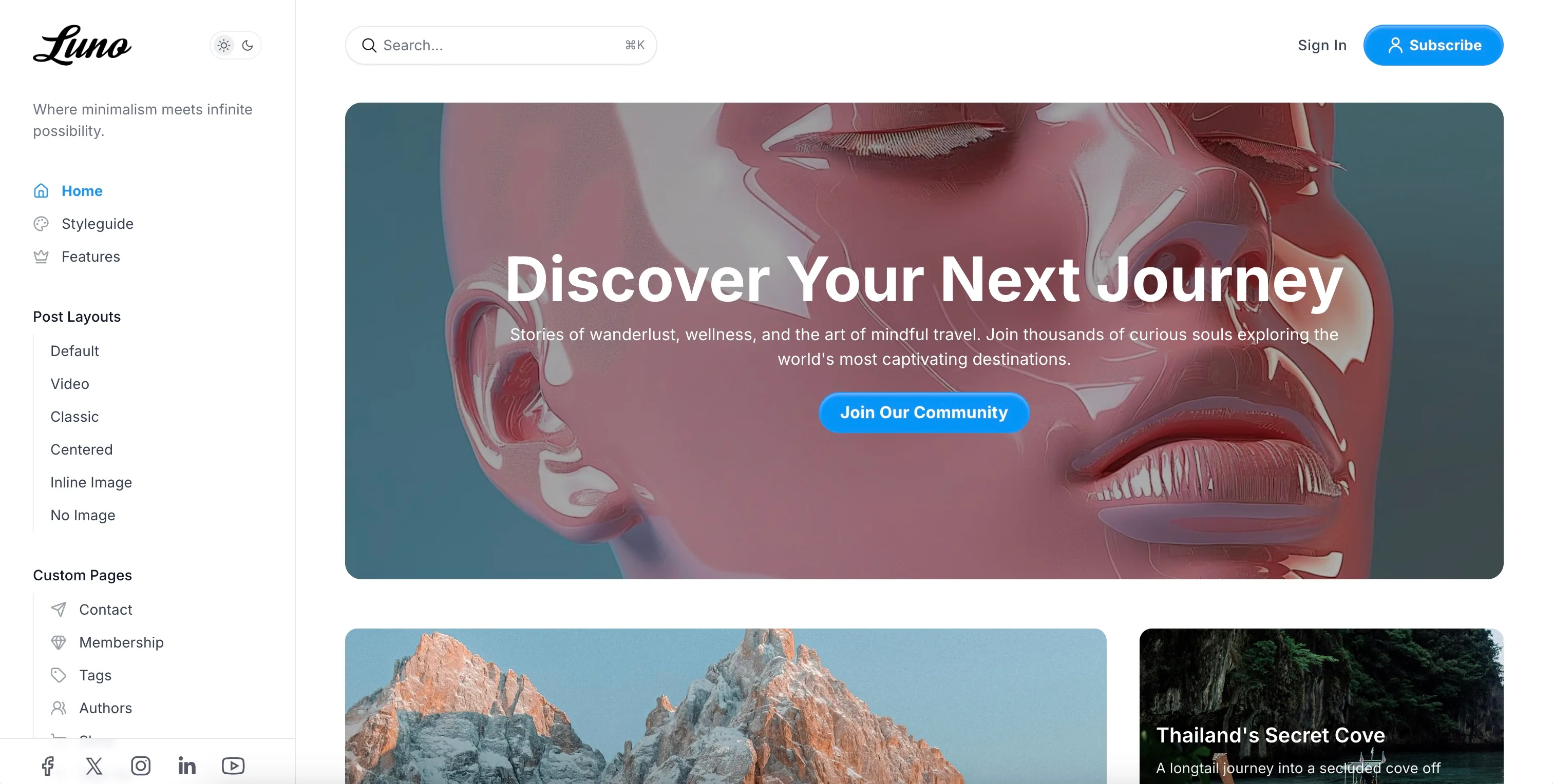
- cover - Full-width background image with content overlay
- split-start - Image on left, content on right
- split-end - Content on left, image on right
Hero Image Style Options:
- original - Display image without modifications
- circle - Circular cropped image
- square - Rounded square image
- same-as-post-card - Match your post card styling
Note: If you don’t add a feature image to your hero page, the theme automatically uses your site’s cover image as a fallback.
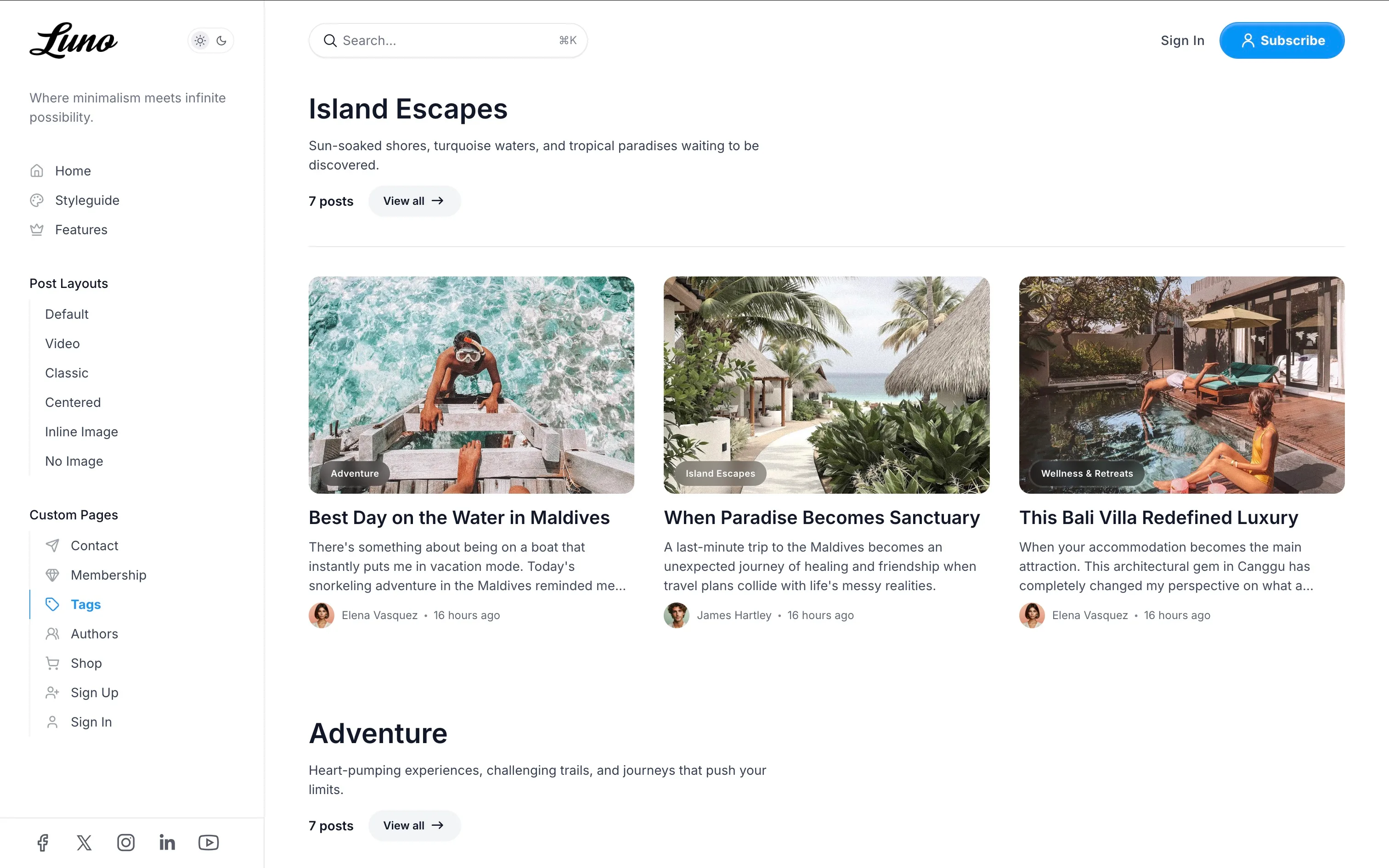
Featured Tags
Highlight specific content categories with dedicated sections on your homepage, each displaying the tag name, description, and latest posts.
Setup:
- Go to
Settings>Design & branding>Customize. - Expand the
Homepagesection. - Find the
Featured tagsfield. - Enter comma-separated tag slugs (e.g.,
technology,design,tutorials). - Click
Save.
Result:
- Each tag gets its own homepage section between your main post feed
- Shows tag name and description
- Displays 3 latest posts from that tag
- “View all” button appears if more than 3 posts exist
- Sections appear in the order you specify
Best Practice: Use 2-4 featured tags for optimal homepage layout and organization.
Tags Filter Carousel
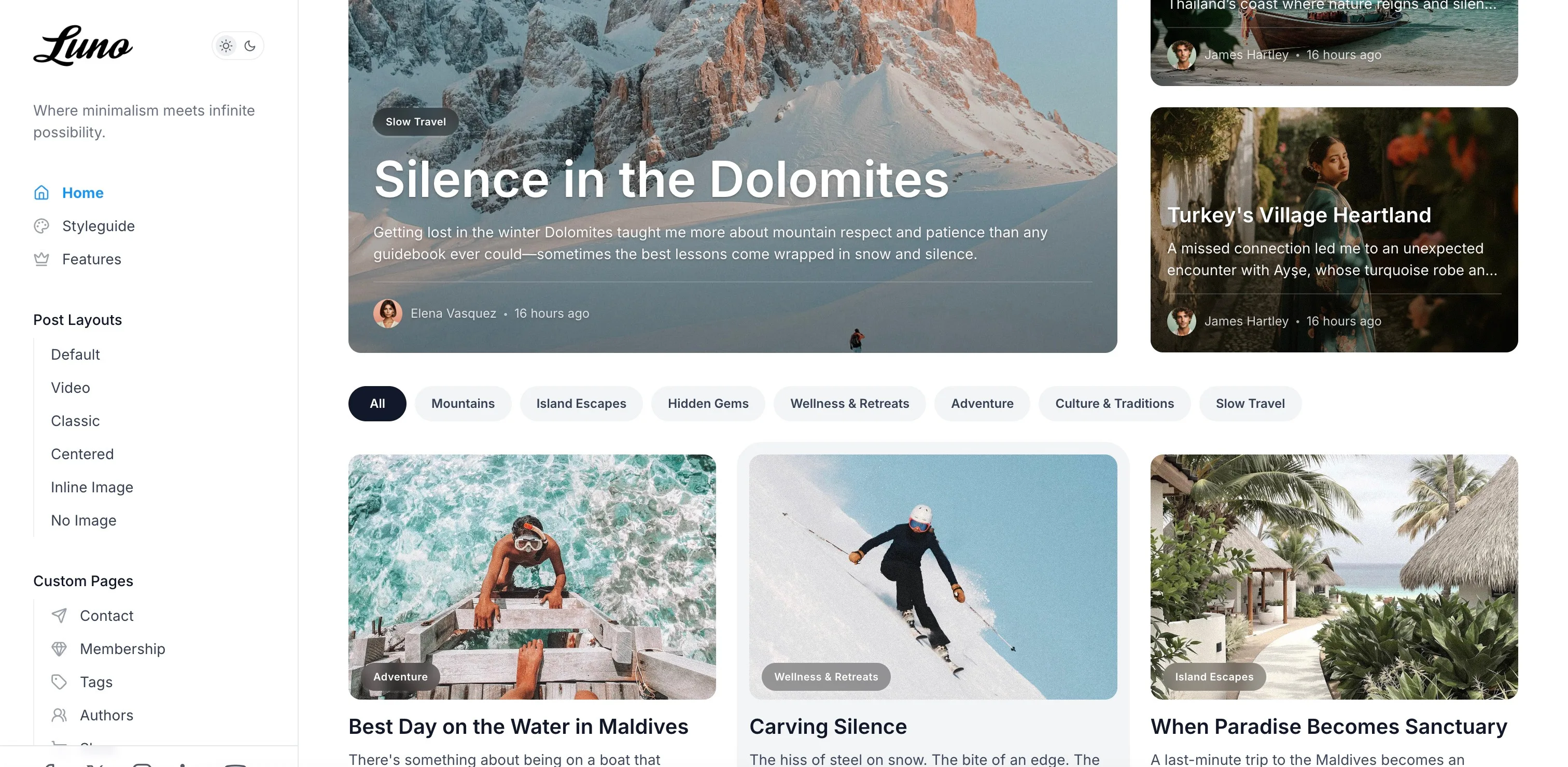
Display a horizontal scrolling navigation of your most popular tags for easy content discovery.
Enable:
- Go to
Settings>Design & branding>Customize>Homepage. - Toggle
Show tag filters carouselON. - Click
Save.
Features:
- Shows top 15 tags by post count
- Horizontal scrollable with left/right arrow controls
- Current tag highlighted in accent color
- “All” button returns to full homepage
- Mobile-friendly with touch scrolling
- Appears at the top of your homepage and tag archive pages
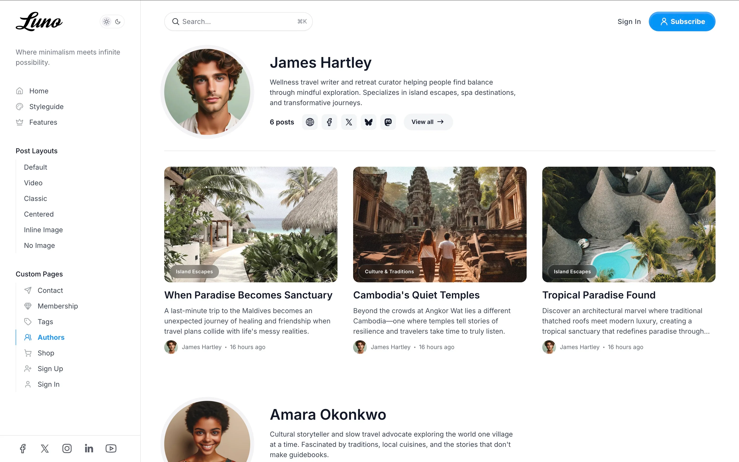
Authors Carousel
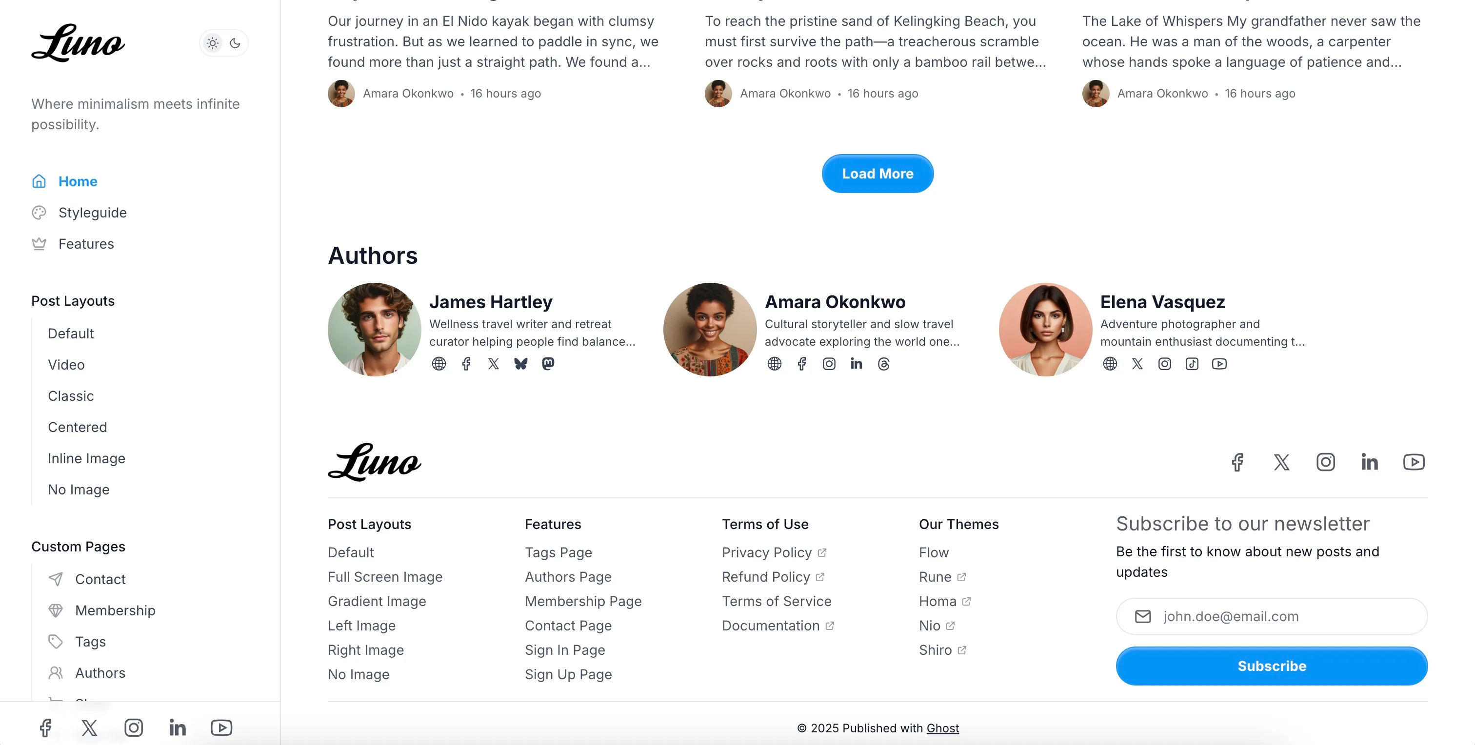
Showcase your writing team with an attractive horizontal carousel featuring profile images, bios, and social links.
Enable:
- Go to
Settings>Design & branding>Customize>Homepage. - Toggle
Show authors listON. - Click
Save.
Displays:
- Profile images (or initials if no image)
- Author names with links to their profiles
- Bio excerpts
- Social media links from their profiles
- Up to 100 authors ordered by post count
- Horizontal scrollable carousel with arrow controls
Best Results: Ensure author profiles in Staff settings have profile images, bios, and social links filled out.
Post Grid Customization
Customize how your post cards appear across the site with aspect ratios and border radius options.
Post Card Aspect Ratio:
Control the shape of post card images throughout your site:
- Go to
Settings>Design & branding>Customize>Homepage. - Find
Post card image aspect ratio. - Choose from 7 options:
16:9- Widescreen (default) - cinematic, modern3:2- Classic photo ratio4:3- Traditional - balanced1:1- Square - Instagram style4:5- Portrait - magazine style2:3- Tall portrait9:16- Vertical/story format
- Click
Save.
Card Border Radius:
Control the roundness of cards, images, and buttons:
- Go to
Settings>Design & branding>Customize>Homepage. - Find
Card radius. - Choose from 6 options:
0px- Sharp corners, modern minimal4px- Subtle roundness8px- Slightly rounded12px- Medium rounded (default)16px- Well rounded24px- Very rounded, friendly feel
- Click
Save.
Effect: These settings apply site-wide to all post cards, ensuring visual consistency across homepage, archives, and related posts.
Featured Posts
Control which posts appear first on your homepage with visual indicators.
How Featured Posts Work: Posts marked as “featured” in Ghost Admin will automatically appear at the top of your homepage before regular posts. Featured posts are displayed in a special grid layout with the first post taking up 2 columns and 2 rows for maximum visual impact.
Marking Posts as Featured:
- Edit a post in Ghost Admin.
- Open post settings (gear icon).
- Toggle
Feature this postON. - Update the post.
Display Behavior: Featured posts appear in order of newest first, followed by regular posts in chronological order.
Subscribe Form
Customize the title and description text above the subscription form:
- Create a new page in Ghost Admin.
- Add your custom title and description in the page content.
- Open page settings.
- Under
Tags, add the tag#subscribe-form. - Publish the page.
The footer automatically uses the most recently updated page with the #subscribe-form tag. Without this tag, default text appears.
Post Settings
Post Templates
Luno includes 6 post templates for different content presentations.
How to Apply:
- Edit a post in Ghost Admin.
- Open post settings (gear icon).
- Under
Template, select your desired template. - Click
Update.
Available Templates:
Default
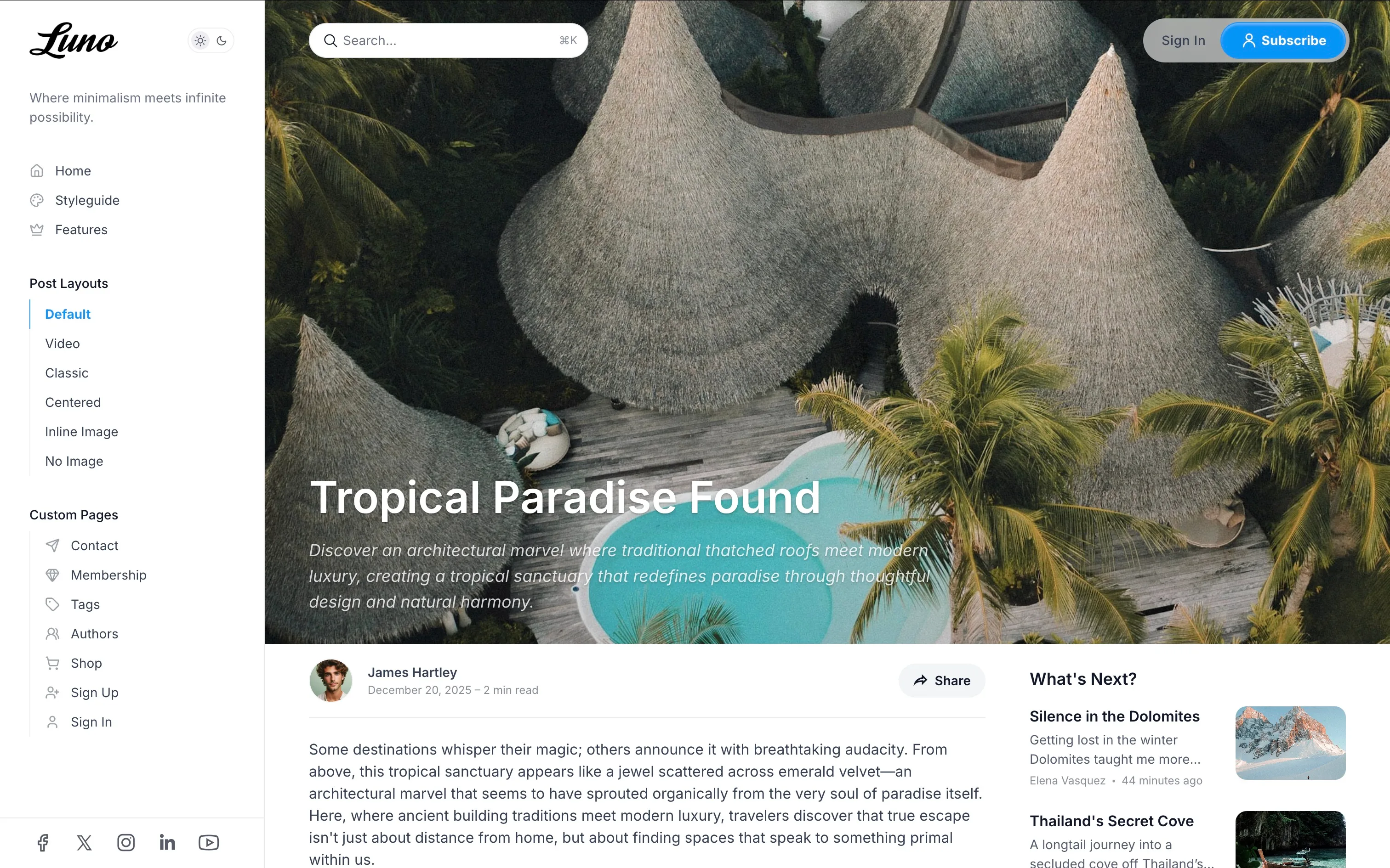
- Standard post layout with feature image at top
- Content with sidebar on desktop
- Perfect for most blog posts
Classic (custom-post-classic)
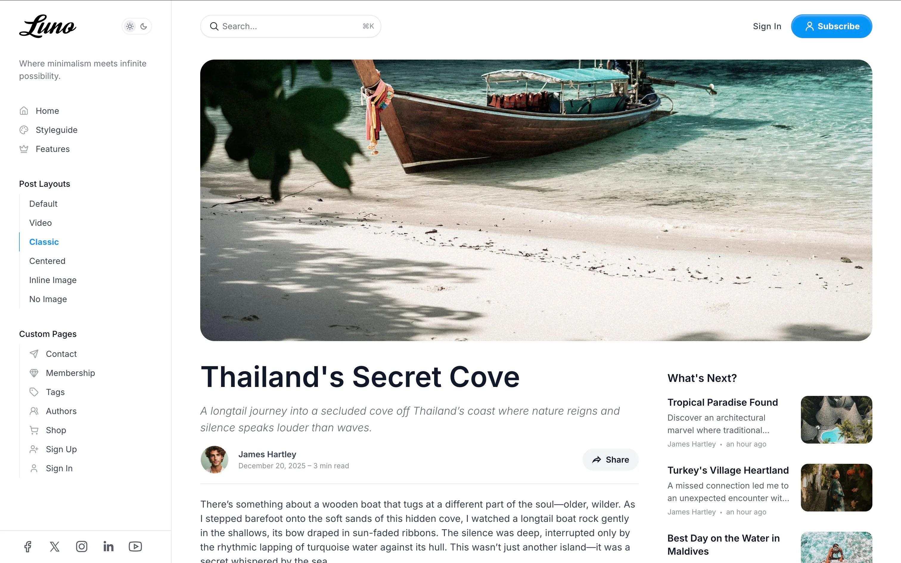
- Traditional blog layout
- Full-width feature image header
- Content with related posts sidebar
- Great for long-form articles
Video (custom-post-video)
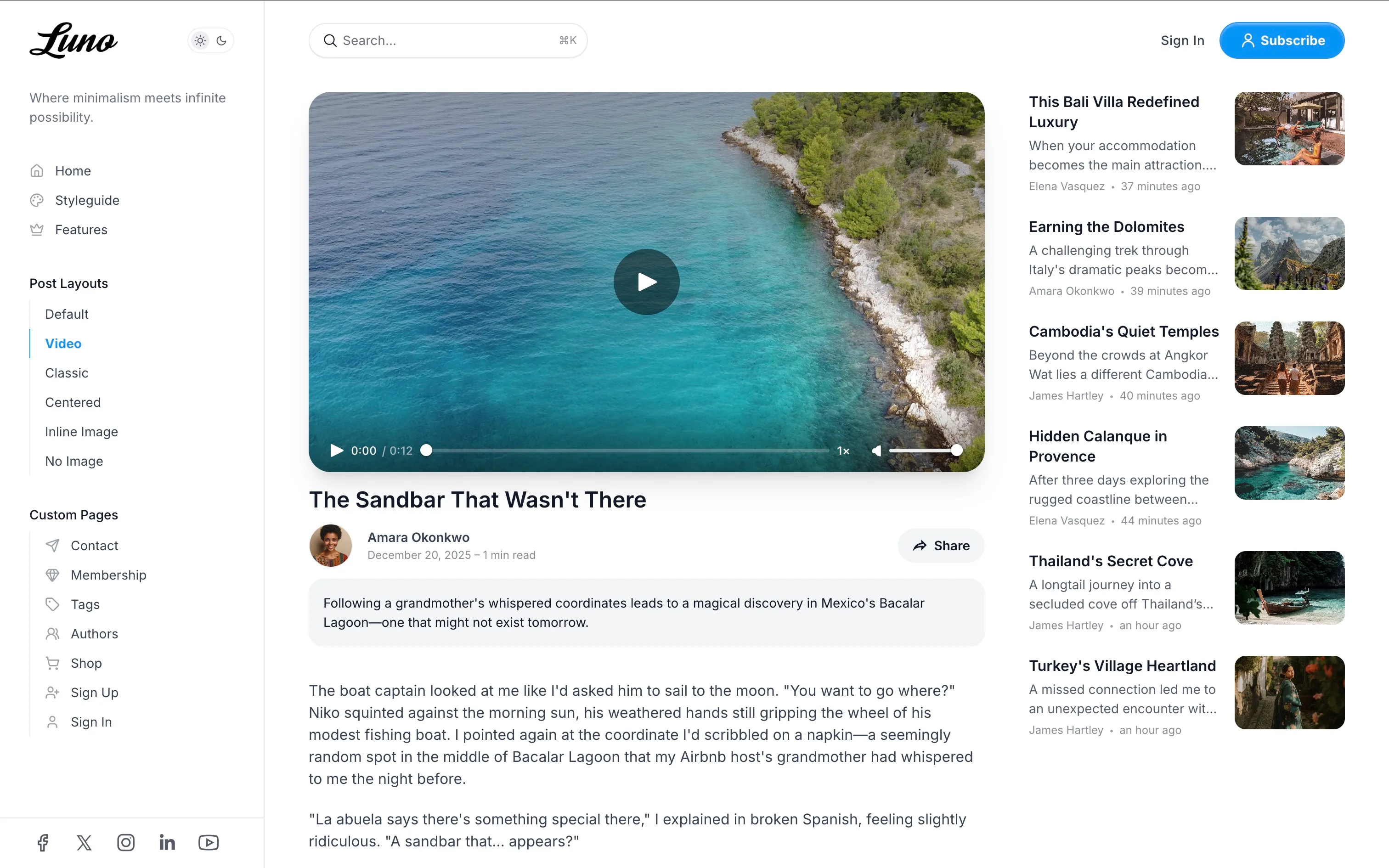
- Optimized for video content
- Displays first video/embed from content in the header area
- Automatically hides duplicate video in the content body
- Ideal for video tutorials, interviews, or media-rich posts
Centered (custom-post-centered)
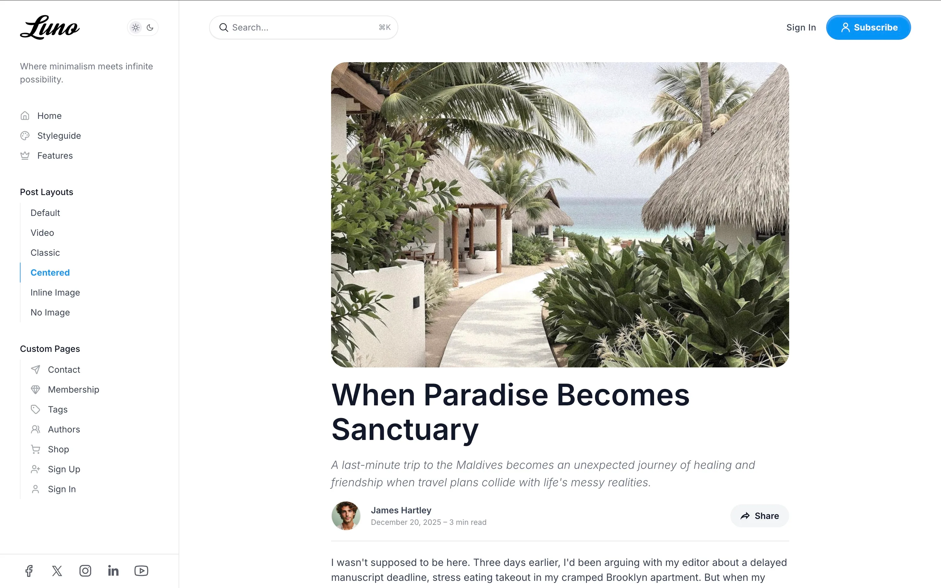
- All content centered in single column
- No sidebar distractions
- Related posts displayed in grid below content
- Ideal for distraction-free reading
Inline Image (custom-post-inline-image)
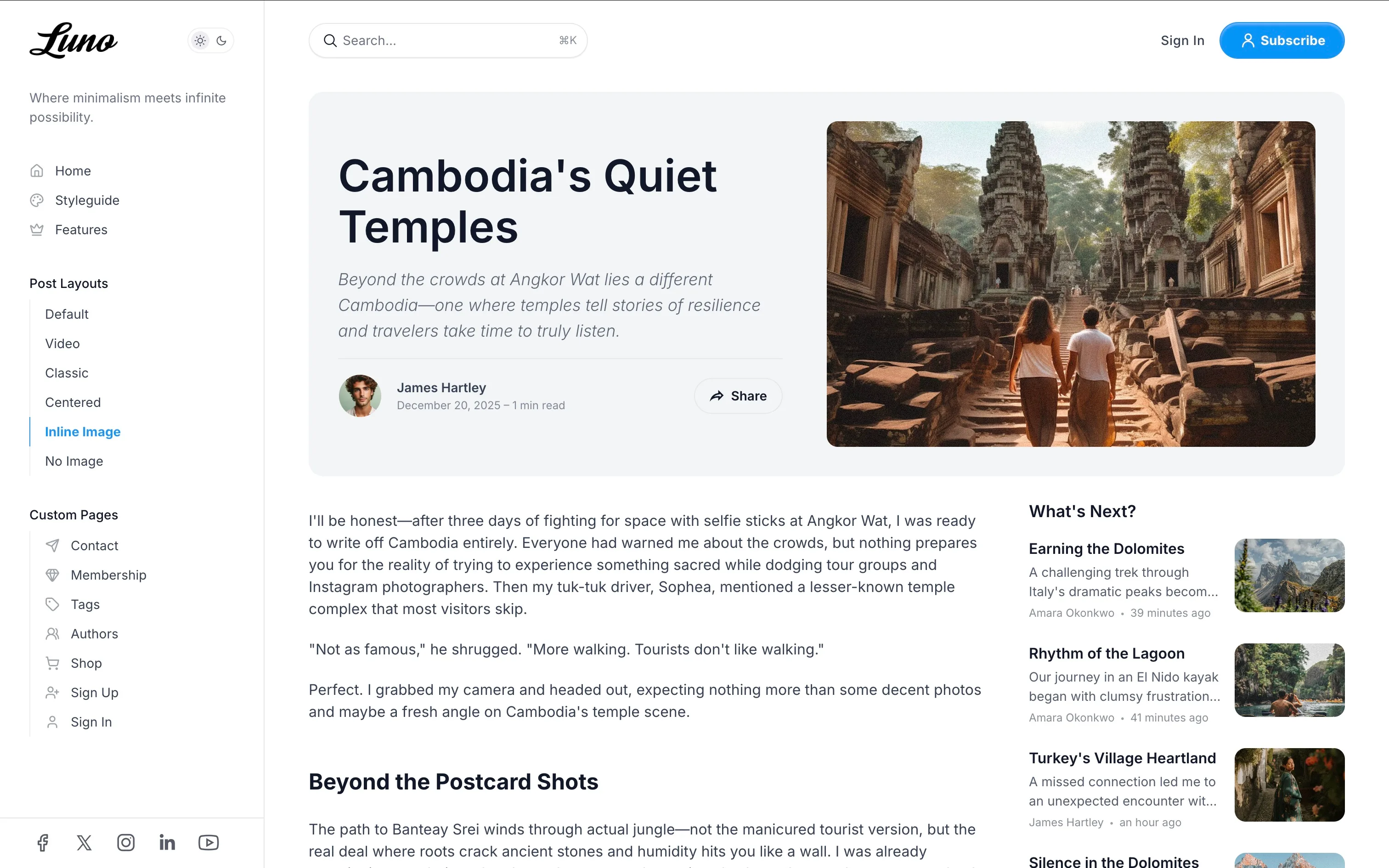
- Feature image and title displayed side-by-side
- Standard content layout with sidebar
- Good for posts where image is secondary to content
No Image (custom-post-no-image)
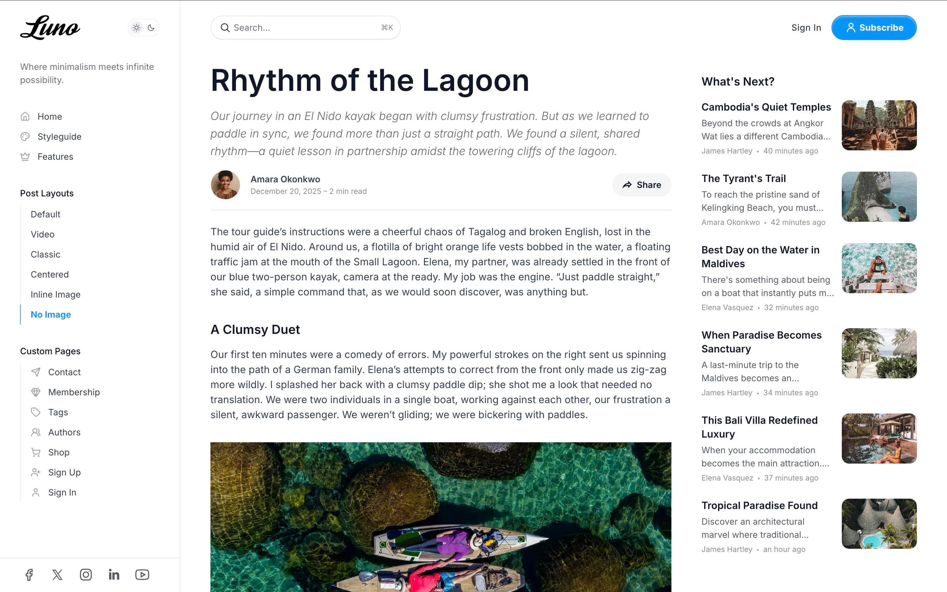
- Clean, text-only layout
- Featured image hidden from display
- Minimal, distraction-free reading experience
Table of Contents
Auto-generate a navigable table of contents for long-form posts, making it easy for readers to jump between sections.
Enable:
- Edit a post or page in Ghost Admin.
- Add the internal tag
#table-of-content(type “hash-table-of-content” in the tags field). - Publish the post.
Features:
- Automatically generates links from all H2 and H3 headings
- Appears in the sidebar on desktop (hidden on mobile)
- Sticky positioning - stays visible while scrolling
- Active section highlighting - current section highlighted as you read
- Smooth scroll navigation to sections
- GitHub-style “On this page” design
Best For: Articles over 2000 words with multiple sections, tutorials, guides, documentation
Social Sharing
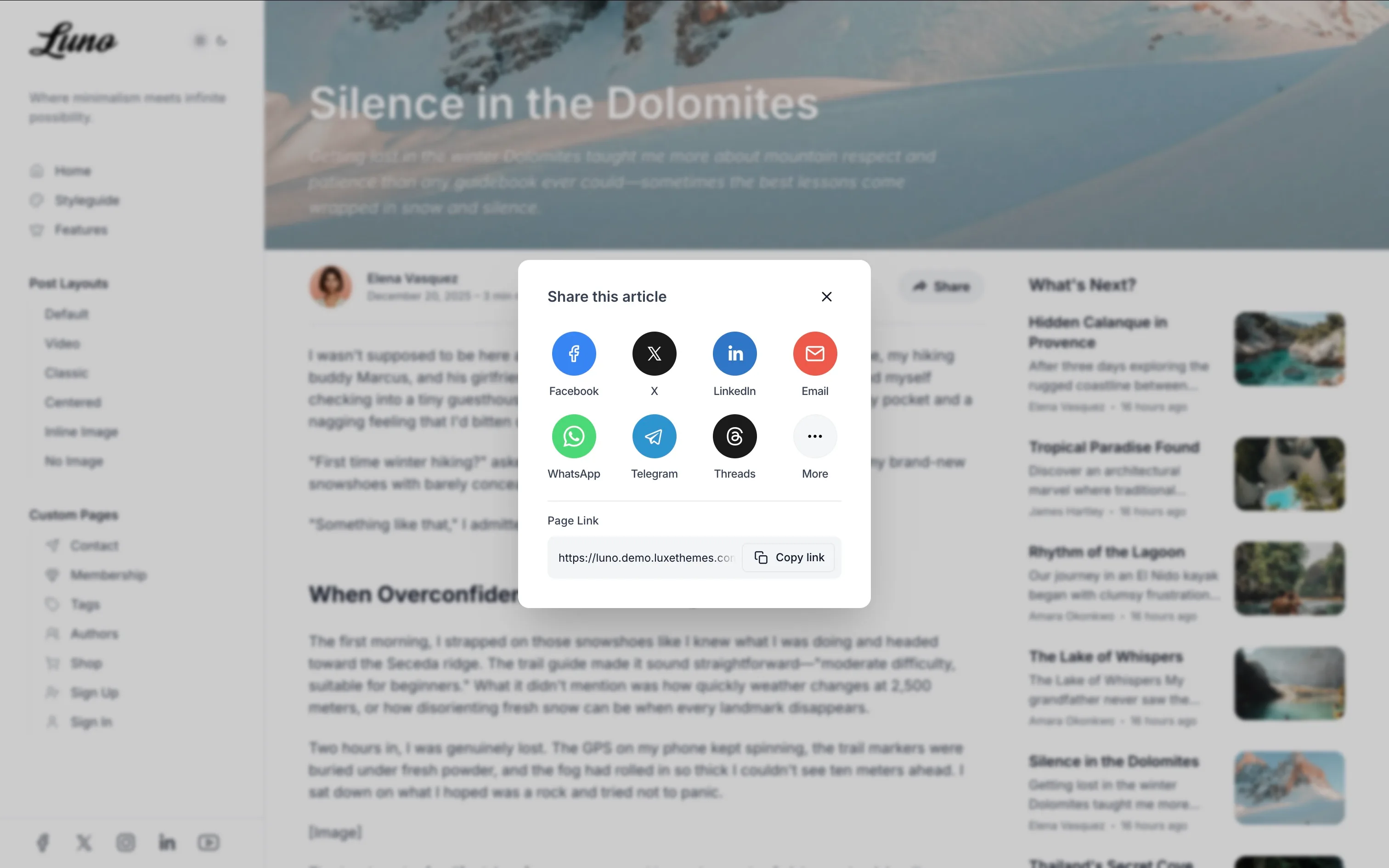
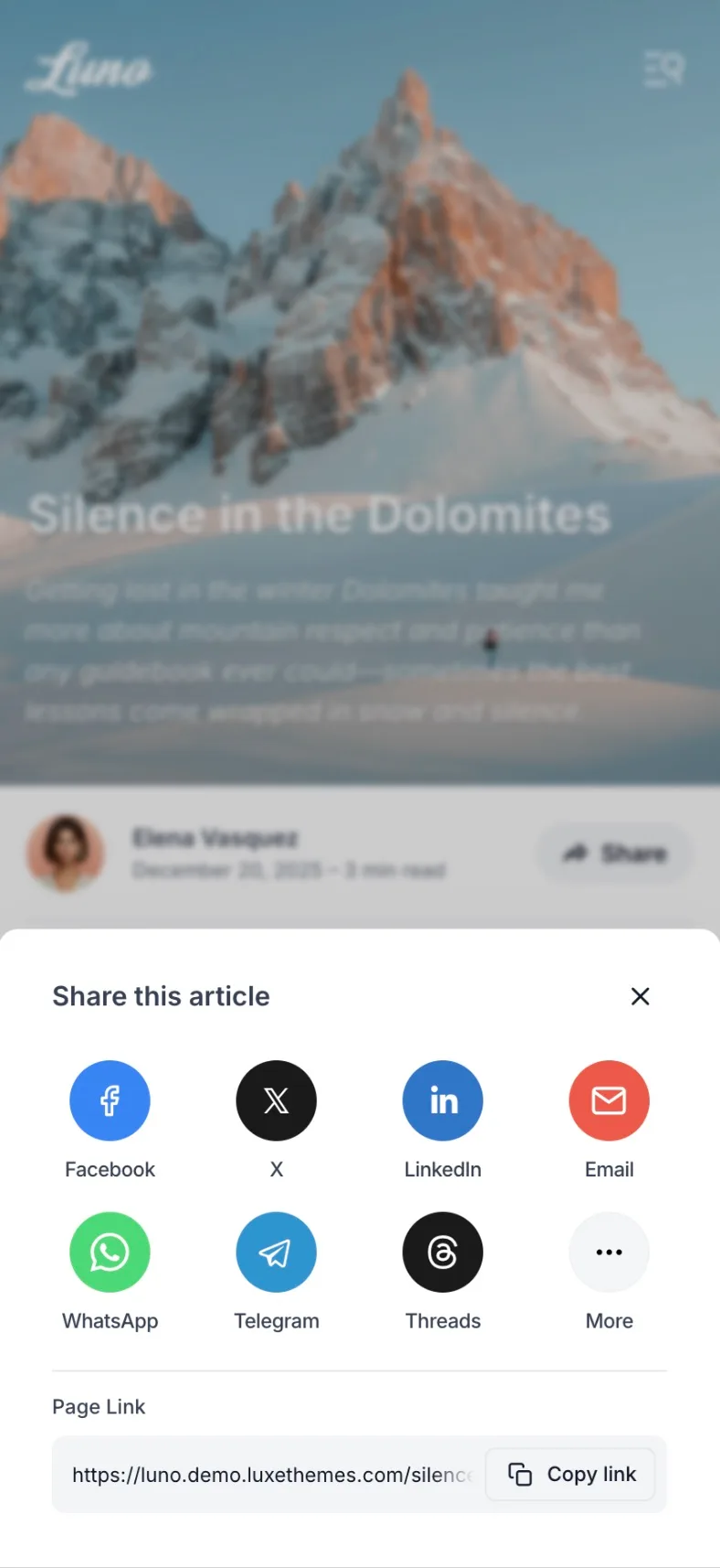
Built-in social sharing dialog with 12 popular platforms, making it easy for readers to share your content.
Platforms Supported: Facebook, X (Twitter), LinkedIn, Email, WhatsApp, Telegram, Threads, Bluesky, Mastodon, Reddit, Pinterest, LINE
Features:
- Share button automatically appears in post footer
- Beautifully designed dialog with platform icons
- One-click link copying with “Copy link” button
- Mobile-optimized layout
- Opens in dialog/modal for clean UX
No configuration needed - works automatically on all posts and pages.
Image Gallery & Lightbox
Automatic full-screen lightbox for all content images powered by PhotoSwipe, providing an immersive image viewing experience.
Features:
- Click any image for full-screen view
- Swipe or use arrow keys to navigate between images
- Pinch to zoom on mobile
- Image captions displayed
- Keyboard accessible (arrow keys, ESC to close)
- Smooth animations and transitions
No configuration needed - automatically activates for all images in post content.
Scroll Indicator
Show a circular reading progress indicator at the bottom right of the screen:
- Go to
Settings>Design & branding>Customize. - Under
Site-wide, findShow scroll indicator. - Toggle it on or off.
- Click
Save.
The scroll indicator appears as a circular progress ring that fills as the user scrolls through the page and can be clicked to scroll back to the top.
Post Suggestions
Display related posts at the bottom of each article:
- Go to
Settings>Design & branding>Customize. - Under
Post, findShow post suggestions. - Toggle it on or off.
- Click
Save.
Comments
Enable Ghost’s built-in commenting system:
- Go to
Settings>Membership. - Under
Access, clickEditforCommenting. - Choose who can comment (Nobody, All members, Paid members).
- Click
Save.
Page Templates
Luno includes several templates for creating custom pages.
Authors Page
Create a page listing all site authors with their profiles:
- Create a new page in Ghost Admin (e.g., title “Our Team”).
- Open page settings (gear icon).
- Under
Template, selectAuthors. - Set the page URL to
/authors. - Publish the page.
Ensure author profiles in Staff settings have a profile image, bio, and any relevant social links filled out.
Tags Page
Create a page listing all tags used on your site:
- Create a new page (e.g., title “Topics”).
- Open page settings.
- Under
Template, selectTags. - Publish the page.
Add this page to your site navigation for easy access. For best results, ensure your tags have descriptions and feature images set under Tags in Ghost Admin.
Membership Page
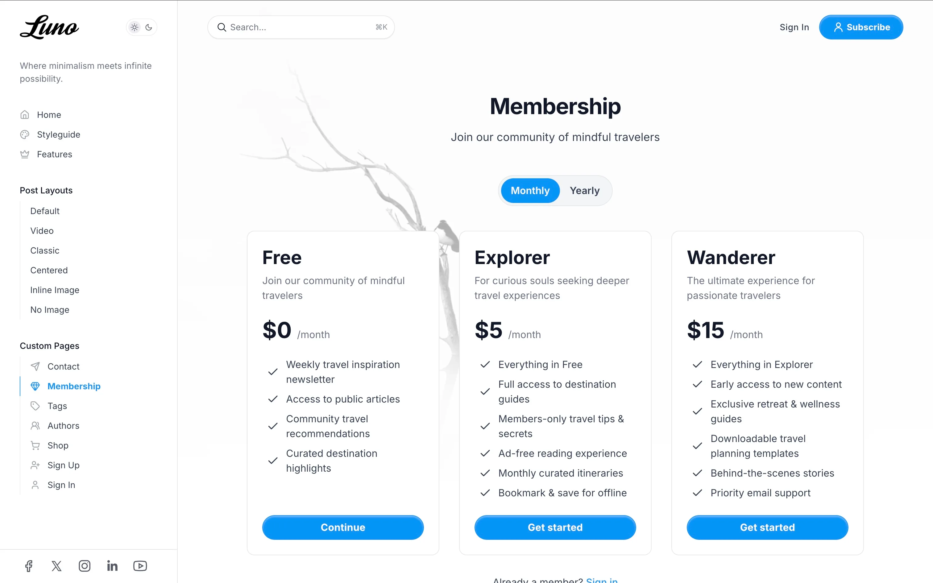
Create a dedicated page to display your membership tiers and allow visitors to subscribe.
- Create a new page in Ghost Admin (e.g., title “Become a Member”).
- Add a
Custom excerptin the page settings to display a short introductory text below the title. - Add any additional content, like an FAQ section, in the main editor. This will appear below the pricing tiers.
- You can also add a
Feature imageto the page, which will be displayed as a background for the pricing section. - Open page settings (gear icon).
- Under
Template, selectMembership. - Publish the page.
The page will automatically pull in your active tiers from Settings > Membership > Tiers.
Contact Page
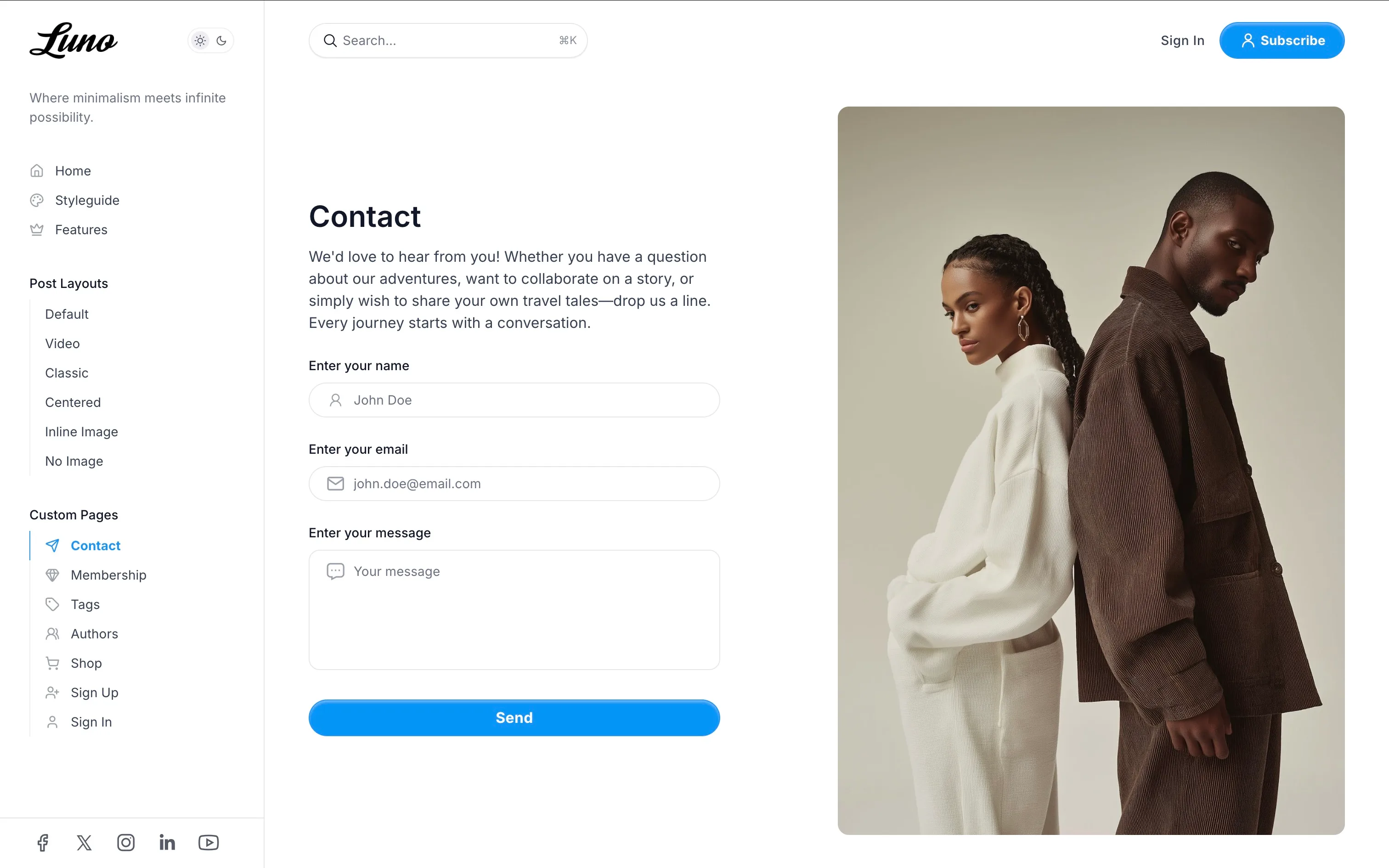
Add a contact form to your site:
- Sign up for a form service like Formspree or Getform and get your unique form endpoint URL.
- Go to
Settings>Design & branding>Customize. - Under
Site-wide, findContact form url. - Paste your form endpoint URL.
- Click
Save. - Create a new page (e.g., title “Contact Us”).
- Add any introductory text or contact details in the page editor.
- Open page settings.
- Under
Template, selectContact.
Wide Page Template
Create full-width pages that break out of standard content constraints, perfect for landing pages, portfolios, or visual layouts.
Features:
- Full-width feature image header with gradient overlay
- Content area expands to full container width
- Title and excerpt overlaid on feature image
- No sidebar or content width restrictions
Setup:
- Create a new page in Ghost Admin.
- Add your content in the page editor.
- Optionally add a feature image for dramatic header effect.
- Open page settings (gear icon).
- Under
Template, selectWide Page. - Publish the page.
Use Cases: Landing pages, full-width product showcases, portfolio pages, visual presentations
Shop Template
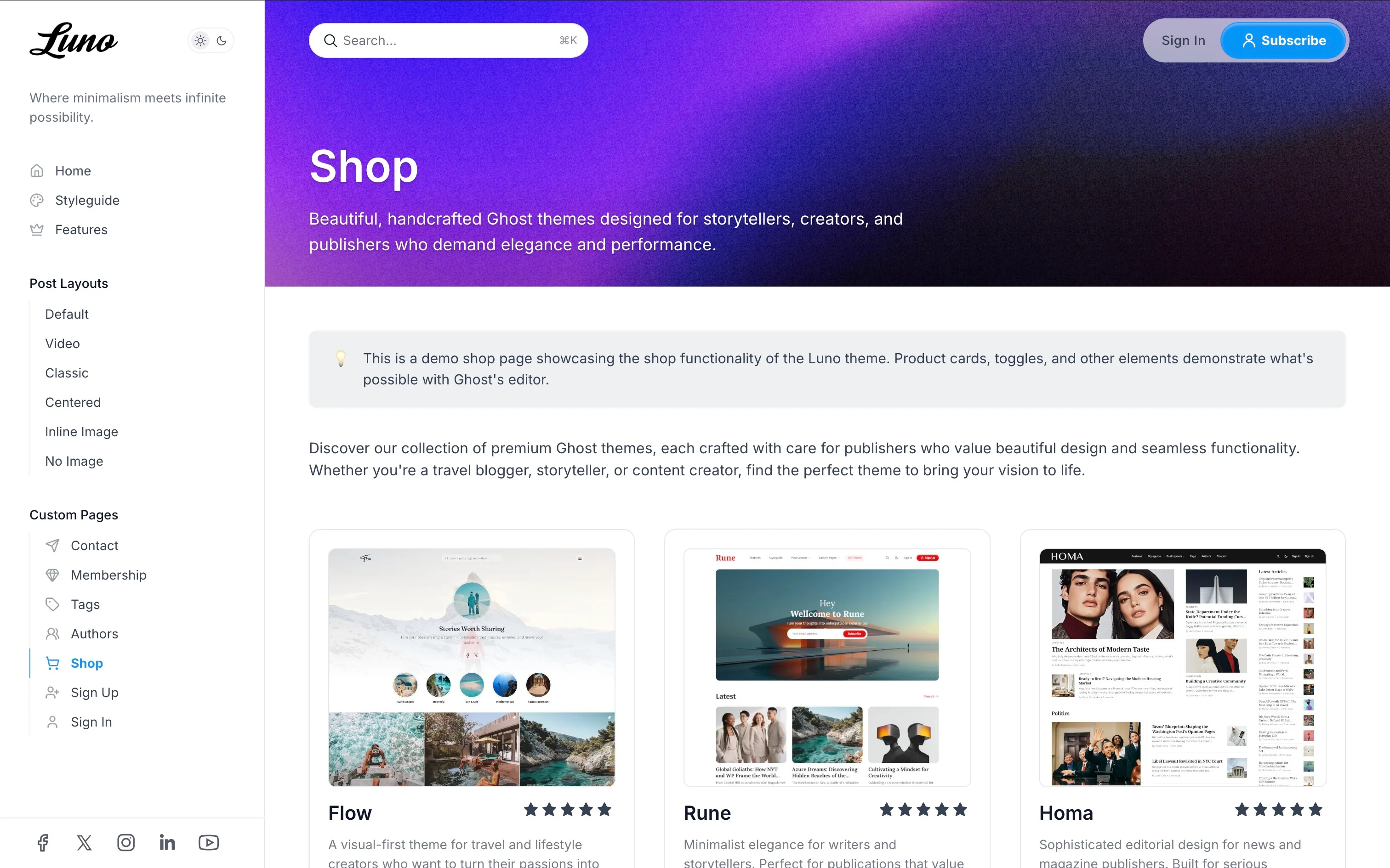
Specialized template for displaying products in a professional grid layout, ideal for e-commerce or product catalogs.
Features:
- Full-width feature image header with cover style
- Ghost product cards automatically arranged in responsive 3-column grid
- Responsive: 1 column on mobile, 2 columns on tablet, 3 columns on desktop
- Other content (text, images) spans full width between products
Setup:
- Create a new page in Ghost Admin (e.g., title “Products” or “Shop”).
- Add Ghost product cards in the editor (use the + menu and select “Product”).
- Optionally add introductory text or sections between products.
- Add a feature image for an eye-catching header.
- Open page settings (gear icon).
- Under
Template, selectShop. - Publish the page.
Use Cases: Product catalogs, digital downloads showcase, services listing, online shop pages
Sign In and Sign Up Pages
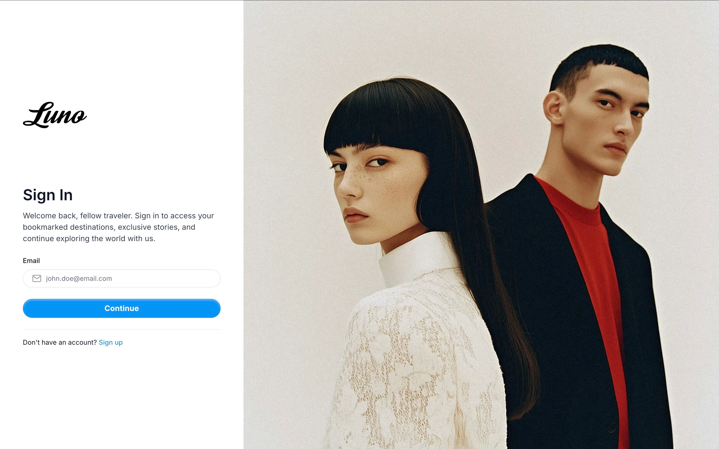
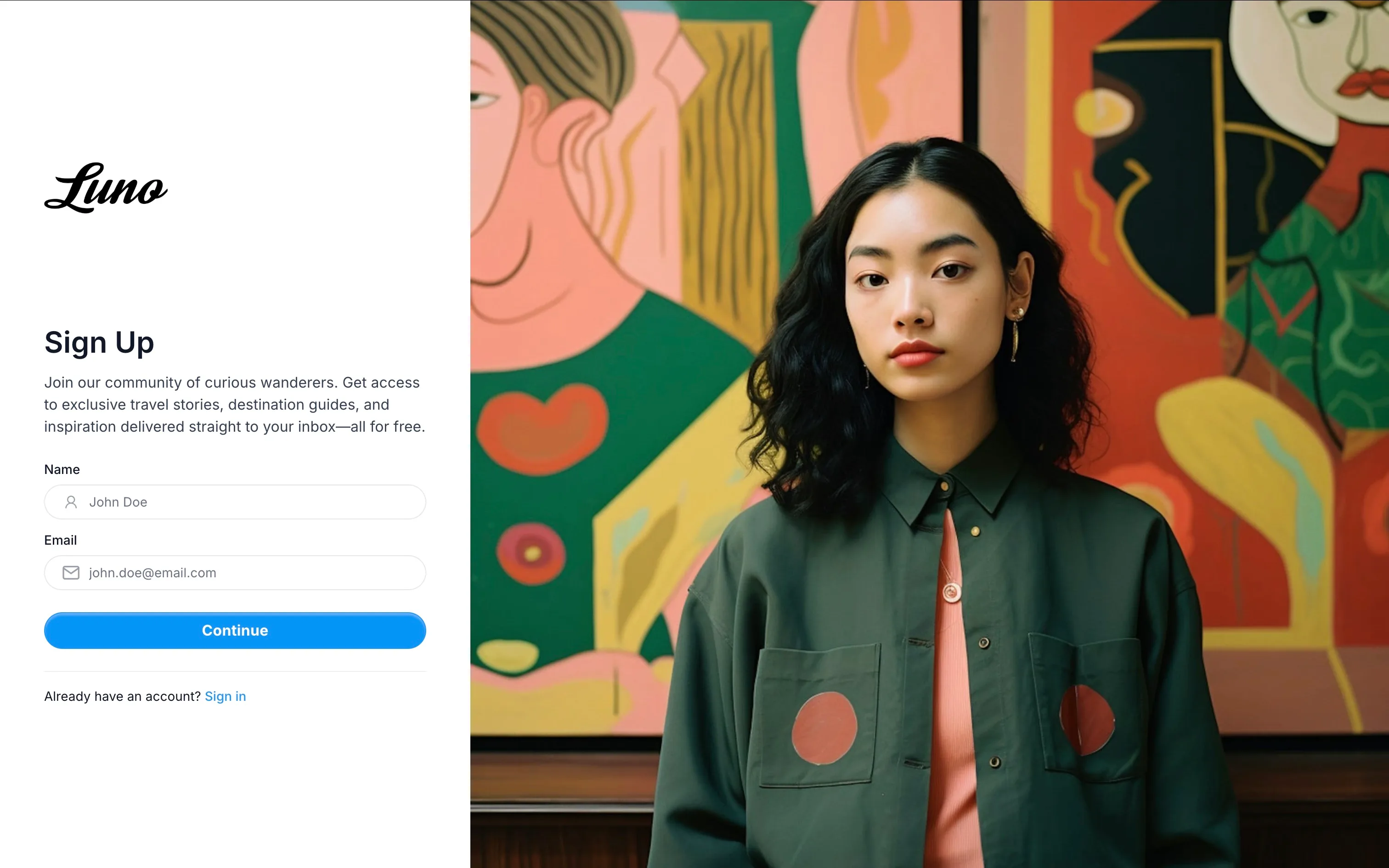
Create custom sign-in and sign-up pages with your own content and styling, or use Ghost’s built-in portal.
Using Ghost Portal (Default):
By default, Luno uses Ghost’s built-in authentication portal for sign-in and sign-up. No additional setup required.
Using Custom Pages:
To use custom sign-in/sign-up pages instead of Ghost’s portal:
- Go to
Settings>Design & branding>Customize. - Under
Site-wide, findUse custom sign-in/sign-up pages. - Toggle it ON.
- Click
Save.
Creating the Sign In Page:
- Create a new page in Ghost Admin (e.g., title “Sign In”).
- Add custom content in the page editor (welcome message, instructions, etc.).
- Optionally add a feature image that will be displayed on the right side of the page.
- Open page settings.
- Under
Template, selectSign In. - Set the page slug to
sign-infor consistent URLs. - Publish the page.
Creating the Sign Up Page:
- Create a new page in Ghost Admin (e.g., title “Join Us”).
- Add custom content in the page editor (benefits, call-to-action text, etc.).
- Optionally add a feature image for visual appeal.
- Open page settings.
- Under
Template, selectSign Up. - Set the page slug to
sign-upfor consistent URLs. - Publish the page.
Image Fallback: If no feature image is set for the page, the theme will automatically use your site’s cover image as a fallback for the visual side of the layout.
Advanced CSS Customization
Luno allows you to customize visual elements beyond the Ghost admin settings by overriding CSS variables. This gives you fine-grained control over colors, shapes, and sizes without editing theme files.
How to Add Custom CSS:
- Go to
Settings>Code injectionin Ghost Admin. - In the
Site Headersection, add a<style>tag with your custom CSS variables. - Click
Save.
Example:
<style>  :root {    /* Color Customization */    --color-page: #ffffff;                    /* Main background color */    --color-page-alt: #f3f4f6;                /* Secondary background color */    --color-content: #374151;                 /* Main text color */    --color-content-alt: #111827;             /* Headings and emphasis */    --color-stroke: #e5e7eb;                  /* Border color */
    /* Button Customization */    --button-border-radius: 0.5rem;           /* Slightly rounded buttons */    --button-background-color: #2563eb;       /* Button background */
    /* Input Field Customization */    --input-border-radius: 0.375rem;          /* Slightly rounded inputs */
    /* Branding */    --site-logo-height: 3rem;                 /* Larger logo */  }</style>
Customizable Variables
Color Variables:
--color-page- Main background color (Default:#ffffffin light mode)--color-page-alt- Secondary background color (cards, inputs)--color-content- Main text color--color-content-alt- Headings and emphasized text color--color-stroke- Border and separator color
Button Variables:
--button-border-radius- Controls button roundness (Default:2.5rem)--button-background-color- Button background color
Input Field Variables:
--input-border-radius- Controls input field roundness (Default:2.5rem)
Branding Variables:
--site-logo-height- Height of your site logo (Default:2.5rem)
Code Block Variable:
--pre-background-color- Background color for code blocks
Best Practices:
- Test your changes in your browser’s developer tools first before adding them permanently
- Keep a backup copy of your custom CSS
- Use color values that maintain good contrast and readability
- Changes apply site-wide, affecting all buttons, inputs, and styled elements
Development
Luno is a modern Ghost theme built with:
- Vite for build tooling
- Tailwind CSS v4 for styling
- TypeScript for enhanced JavaScript functionality
- PhotoSwipe for image galleries
- Infinite scroll for content loading
Development Setup
To edit the theme files:
- Download the theme ZIP file from Ghost Admin.
- Unzip the file on your local machine.
- Open the theme folder in your preferred code editor.
The theme uses Tailwind CSS for styling and TypeScript for scripts. You’ll need to set up a development environment to work with these files.
Setting Up the Development Environment
- Ensure you have Node.js installed on your system.
- Open a terminal/command prompt in the theme folder.
- Run
npm installto install the required dependencies.
Working with Tailwind and TypeScript
The theme uses Vite to bundle and compile Tailwind CSS and TypeScript files. To work with these files:
- Make your changes in the
assets/css/*.cssorassets/js/*.tsfiles. - Run
npm run devto start Vite in watch mode. This will automatically compile your changes. - To build for production, run
npm run build.
Important Files and Folders
assets/css/: Contains CSS files includingvariables.cssfor theme variablesassets/js/: Contains TypeScript files including web componentspartials/: Contains reusable Handlebars template partslocales/: Contains 46 language translation filestailwind.config.cjs: Tailwind configurationvite.config.js: Vite build configuration
Remember to thoroughly test all changes across different devices and browsers before deploying to a live site.
Language Translations
This theme is translated into 46 languages. The translation files are located in the locales/ folder.
| Language | Code |
|---|---|
| 🇿🇦 Afrikaans | af |
| 🇦🇱 Albanian | sq |
| 🇸🇦 Arabic | ar |
| 🇧🇦 Bosnian | bs |
| 🇧🇷 Brazilian Portuguese | pt-BR |
| 🇧🇬 Bulgarian | bg |
| 🇪🇸 Catalan | ca |
| 🇨🇳 Chinese | zh |
| 🇹🇼 Chinese (Traditional) | zh-Hant |
| 🇭🇷 Croatian | hr |
| 🇨🇿 Czech | cs |
| 🇩🇰 Danish | da |
| 🇳🇱 Dutch | nl |
| 🇬🇧 English | en |
| 🌍 Esperanto | eo |
| 🇫🇮 Finnish | fi |
| 🇫🇷 French | fr |
| 🇩🇪 German | de |
| 🇨🇭 German (Swiss) | de-CH |
| 🇬🇷 Greek | el |
| 🇭🇺 Hungarian | hu |
| 🇮🇸 Icelandic | is |
| 🇮🇩 Indonesian | id |
| 🇮🇹 Italian | it |
| 🇯🇵 Japanese | ja |
| 🇰🇷 Korean | ko |
| 🇱🇹 Lithuanian | lt |
| 🇲🇰 Macedonian | mk |
| 🇲🇾 Malay | ms |
| 🇲🇳 Mongolian | mn |
| 🇳🇴 Norwegian | no |
| 🇳🇴 Norwegian Nynorsk | nn |
| 🇵🇱 Polish | pl |
| 🇵🇹 Portuguese | pt |
| 🇷🇴 Romanian | ro |
| 🇷🇺 Russian | ru |
| 🏴 Scottish Gaelic | gd |
| 🇷🇸 Serbian | sr |
| 🇱🇰 Sinhala | si |
| 🇸🇰 Slovak | sk |
| 🇸🇮 Slovenian | sl |
| 🇪🇸 Spanish | es |
| 🇸🇪 Swedish | sv |
| 🇹🇭 Thai | th |
| 🇹🇷 Turkish | tr |
| 🇺🇦 Ukrainian | uk |
| 🇺🇿 Uzbek | uz |
| 🇻🇳 Vietnamese | vi |
To use a different language:
- In Ghost Admin, go to Settings > General.
- Set the “Site language” to the desired language code (e.g., “es” for Spanish).
To modify translations:
- Open the corresponding language file in the
locales/folder (e.g.,es.jsonfor Spanish). - Edit the translations as needed.
- Save the file and rebuild the theme.
Third Party Materials
These resources helped to make this theme possible. A big thank you to the creators and contributors for their work.
JavaScript && CSS
- PhotoSwipe
- Infinite Scroll
- ReframeJS
- Blossom Carousel
- Vite
- Tailwind CSS v4
- Tailwind Typography
- Autoprefixer
- PostCSS
- BravoBit Icon Font Generator
Fonts
- Bitter
- Cardo
- Chakra Petch
- Della Respira
- Fira Mono
- Fira Sans
- Fraunces
- IBM Plex Serif
- Inter
- JetBrains Mono
- Libre Baskerville
- Lora
- Manrope
- Merriweather
- Noto Sans
- Noto Serif
- Nunito
- Old Standard TT
- Poppins
- Roboto
- Rufina
- Source Serif 4
- Space Grotesk
- Space Mono
- Tenor Sans
Support
If you need additional help with the theme, please contact me at support@luxethemes.com.
Good luck with your site!
All the best,
Stefan from LuxeThemes
Changelog
All notable changes to this theme will be documented here
1.0.0
- Initial release of the theme